Home tours
House tour of Kate Pearce’s mid-century vintage home
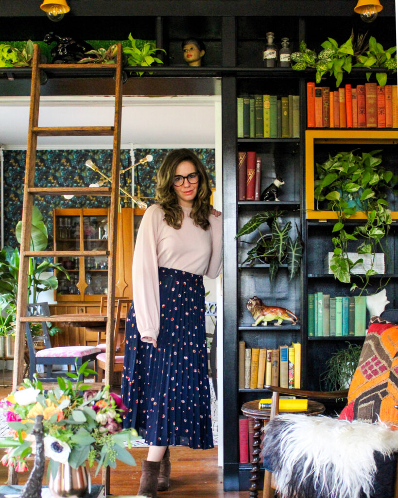
This Long Island home is packed full of mid-century pieces, vibrant colours and retro details so take a tour of Kate Pearce’s home with me to be inspired by her style…
This Long Island home is packed full of mid-century pieces, vibrant colours and retro details so take a tour of Kate Pearce’s home with me to be inspired by her style…
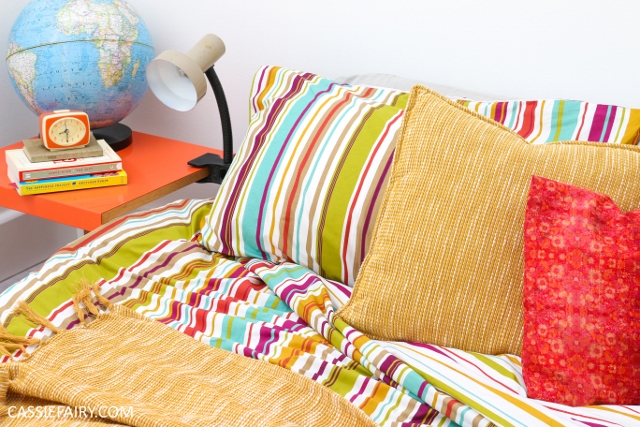
Hurrah! We finally have some new bedding for our new bedroom. After weeks spent stripping off wallpaper, days painting layers and layers of while emulsion
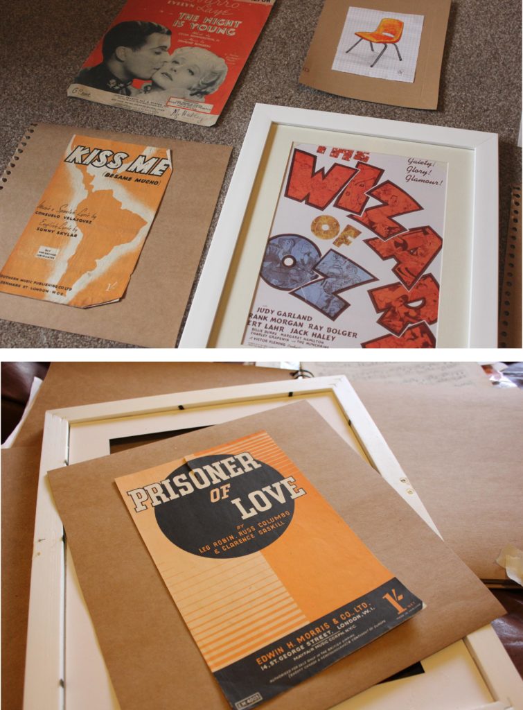
Ever since I framed up a selection Christmas quotes and hung them on my living room walls during the festive period, I’ve been thinking ahead

It’s Pieday Friday and here’s another yummy cupcake recipe that you can prepare in advance, ready for your Halloween parties or just for a tasty treat
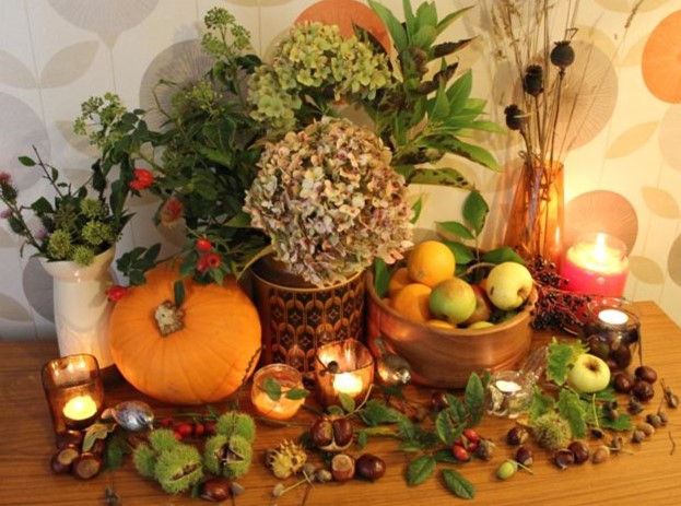
When the leaves begin changing and the pumpkins start arriving in the stores it can only mean one thing: it’s time to start decorating your home for Autumn – or at least that’s the case according to Pinterest ha! It’s certainly a new trend here in the UK to start decorating your home for Autumn in much the same way you’d decorate for Christmas.
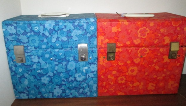
You may remember this blog post that I wrote when I found my first record box from the vintage vinyl fair at Southwold last year. I

I hope you remember that, for most of last year, I have been working on the decor of my living-room of my new home, and
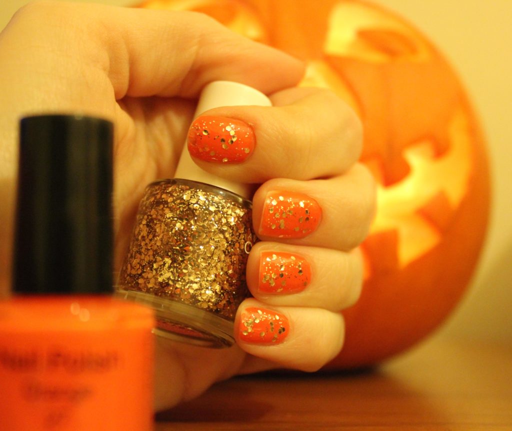
To create a cute pumpkin look for Halloween, and also for the upcoming bonfire night celebrations (I think my nails look a bit like a
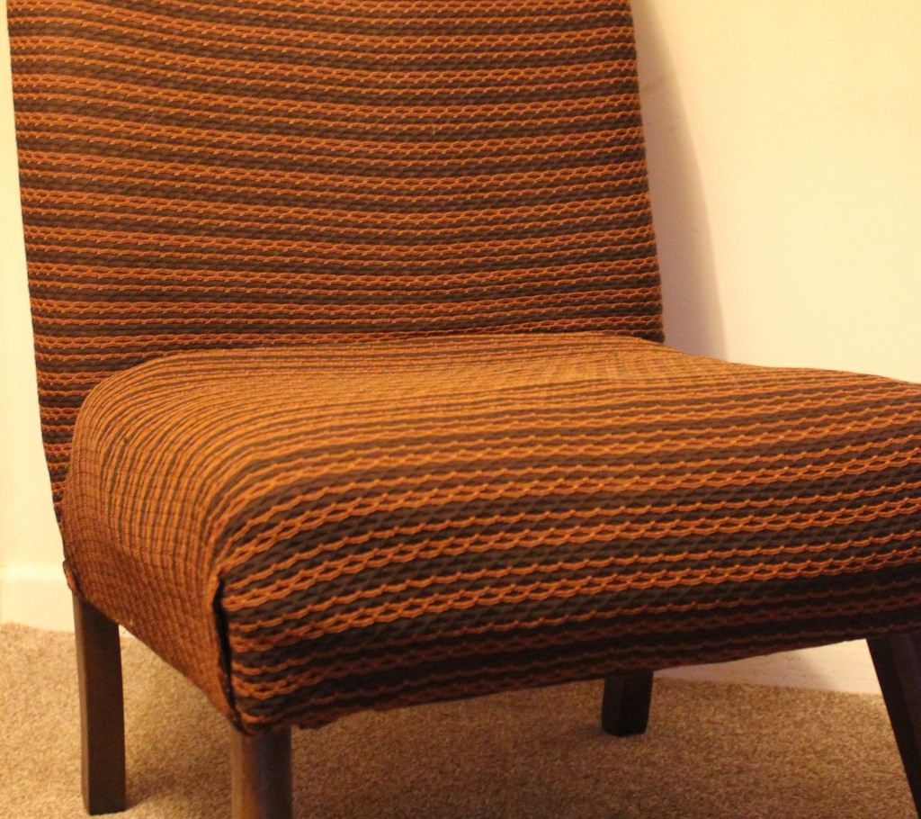
I am pleased to say that I’ve got another freebie for my retro living room design project – an armchair that was on its way
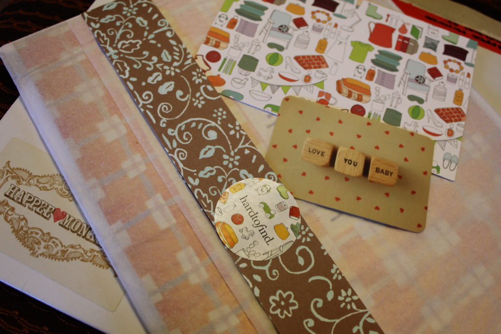
I saw this funky retro-inspired photograph when I was recently browsing on artist Mable Tan’s website Happee Monkee and instantly knew it would be perfect for my

I had a bit of a result last week when I snapped up a load of reduced fruit, and although I’d bought a bit more