Okay, I’m not talking actually about the book but I am putting together a blog post full of inspiration for your home decorating. With the film adaptation of ‘Fifty Shades of Grey’ being released this Valentine’s Day I thought it was about time that I wrote a little something about one of my favourite colours in the world of interior design.
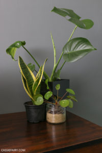
A perfect neutral colour – that is neither plain and dull like magnolia, nor harsh and stark like white, or oppressively dark like black – grey is one of my ‘most pinned’ colours on my Pinterest boards. Just take a look around this blog and you’ll notice that I’ve changed my background to a grey stitch pattern, I’ve redesigned my social icons, I’ve subtly included more grey in photographs and have started using grey text alongside my signature pink accent colour. Yes, I am a fan of grey and I can’t imagine that changing any time soon.
I like the fact that grey can be used in practically any room in the home, it inevitably looks classy and expensive, and there are so many shade variations that there is something for everyone. Yes, I’m sure that ‘Fifty Shades of Grey’ has contributed in some way to an upturn in the popularity of the colour, both in the homes and wardrobes of women everywhere, but designers have been using grey as a backdrop to their interior schemes for years and it’s a trend that just keeps growing as more and more shades, effects and patterns emerge onto the market.
Using Grey patterned bedding and textured cushions
But the best thing about this trend is that you don’t have to go all out with grey walls and furniture, you can simply change a few of the accessories in your home and get the look for less. For example, just changing your bed linen can make a massive difference in a neutral bedroom. Just this week I found out about a competition that Carpetright are running called ’50 Sheets of Grey’ to win a set of gorgeous bedding from the Secret Linen Store and a Sealy Ultimate Support Mattress. I’ve had a look at the gorgeous grey bedding available and – oh my goodness – it is stunning. I’ve been pinning fabric patterns from this range (such as the fern leaf above) and I am definitely entering this competition. All you have to do is describe your perfect Mr. Grey in 50 words or less so why don’t you enter too?
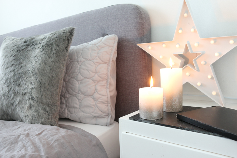
So after all that pinning, I wanted to share some of my favourite looks that include different shades of my favourite colour in this blog post. I also think that texture is important for creating a luxurious look and a splash of bright colour really lifts a dark design scheme to make it work all-year round – such as the sunshine yellow accents above – and it creates a look that is über-cool. Plus, it doesn’t have to me a purely masculine look; grey can be softened with the use of warm pastels to create an on-trend look for Spring by using a dusky shade such as Pantone’s Colour of the Year ‘Marsala’ combined with a soft dove grey.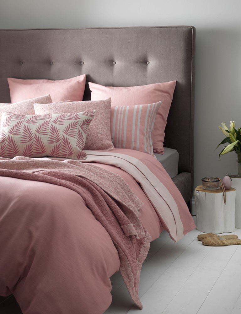
Dusky Marsala & soft grey textures
In spite of being such a fan of grey, I am yet to use it to decorate my own home. Actually, there is some grey in the pattern of my living-room wallpaper, so I have picked this out with a few knitted throws, cushions and a grey coffee table, but I haven’t gone the whole hog and painted the walls yet. I really should invest in a tin of grey paint, because it brings furniture into the limelight and looks great with mid-century modern furniture. My living room is packed full of G-Plan shelves, teak accessories and a Schrieber sideboard, so I’m sure that adding touch of grey will bring the whole mid-century look alive. I think I will start with the hallway (the next makeover on my list!) and use a couple of variations of the colour in this area to see what kind of effect can be achieved in a small space.
What do you think about using this colour in your home decorating? How have you included grey in your interior design schemes so far? Do you think you’ll be using more of this shade in the future? And are you looking forward to the release of the film?? Let me know what you think and please leave me a comment below.
This article is a sponsored collaboration. The pink links in the content indicate a sponsored link or information source. The blog post reflects my own experience and the sponsor hasn’t had any control over my content 🙂














8 responses
Thank you so much, I am delighted that you like the post! I’m even happier that you don’t mind me using your photos haha! 😉 thanks!
Hi Cassie
Thanks so much for this…what a lovely feature! Were so delighted to be included!..we have loads of shades of grey..and we love bed time too! Perfect!
See you soon
Molly and Harriet fro the Secret Linen Store
Haha, I thought I was the only person in the world who hasn’t read the book – now there are two of us haha! I would pretty much have an entirely grey house if it was down to me! X
Thanks Pili, let me know if you decorate in these colours, I’d love to see a photo!
I agree, the ceiling height and decorative features of period homes look great in grey 🙂
I’ve never considered grey in interior designing, but it’s a lovely idea – especially just with the simplicity of buying a new bedsheet. Although, I haven’t read the book so my inspiration would stem from you Cassie, not the casanova Mr Grey!
I love this design! I’ve recently move and I want to redo my room!
Love
Pili
Records of my Troubles
I love the simplicity of grey. Period houses in particular benefit from muted colors. Internally and externally grey would always be my first choice. Love the pink and grey, they look wonderful together.