It’s the first fresh sunny day of the year today and, even though there’s frost on the ground, my thoughts have already turned to spring interiors. I found myself on Pinterest looking for pastel colours and design inspiration, despite the fact that it’s still darkest winter and I need the coal fire on to keep warm. Even so, Spring IS coming and we need to start thinking about these things, especially with my home decorating project coming up imminently. So today I thought I’d try to get you all in the mood for spring with some bright and breezy pastel interiors.
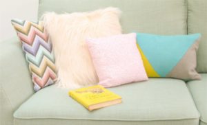
Last year, I styled a spring room with fruity bursts of candy colours alongside my favourite pastel hues. But this year feels different. It feels like more of a grown-up year. Don’t ask me why, but all of the interior design inspiration I see online and in magazines is much more sophisticated than in previous years. It’s all about the light that comes into a room more than the decor, and I believe that nothing can beat bright spring daylight flooding into an airy room. It makes a home feel fresh, yet cosy and welcoming at the same time.

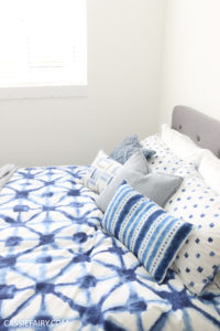
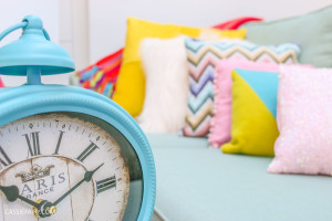
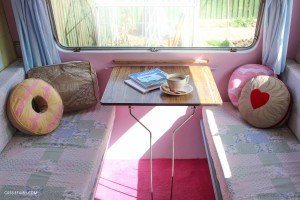
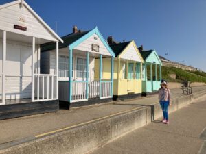
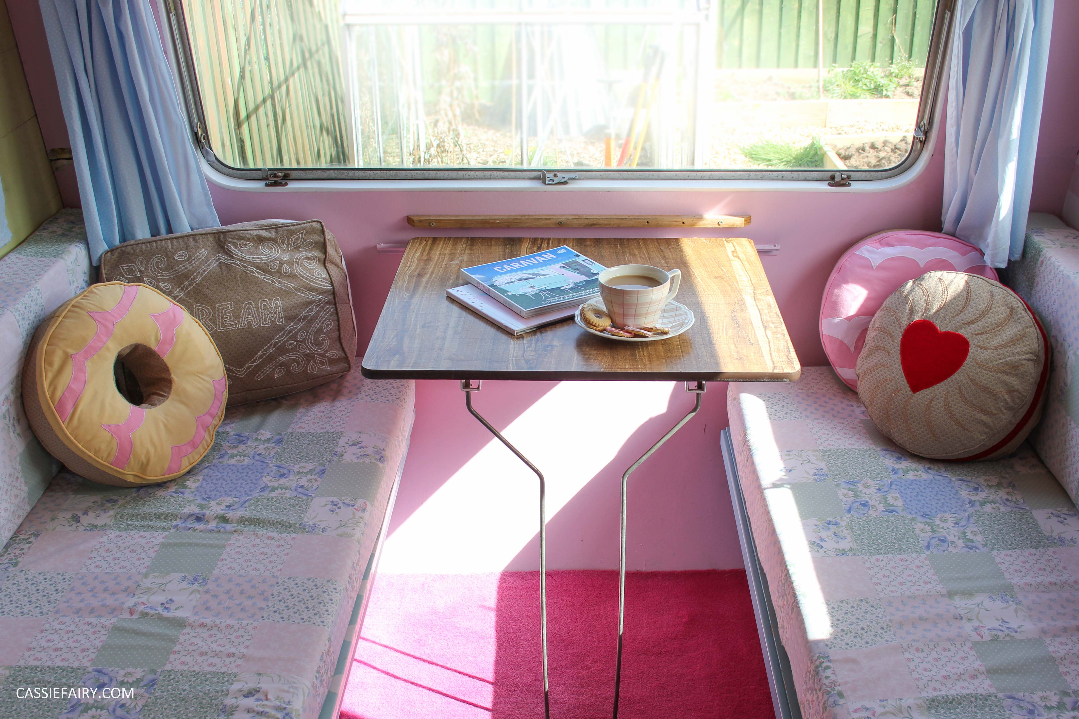
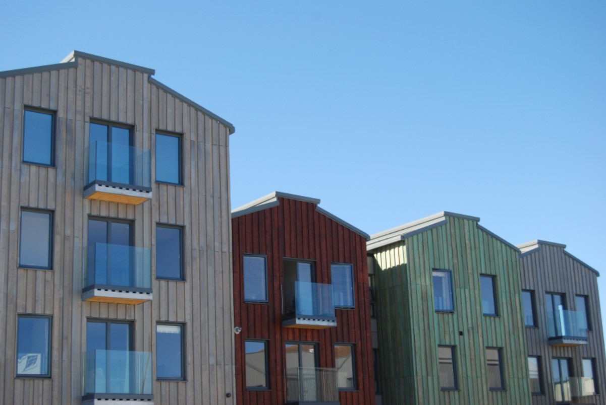
Oddly enough, I’ve found that pastel blue hues can enhance this feeling of brightness and freshness without adding that tinge of coldness that is so often associated with blue rooms. Maybe the paint manufacturers have got the mix just right, because all of the pale blue paints I’ve been looking at have felt anything but cold or clinical. Take any of these rooms, for example. They have the bright yet warm feeling of a coastal holiday home, and I certainly associate that with warmer weather and fresh air.
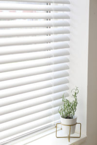
Of course, you can still dress your windows for spring with floaty voiles or crisp cotton curtains, but make sure that they are pulled well back beyond the edges of the window to really allow the light to flood in. Tier on tier shutters are an even more convenient way to bring more brightness into bedrooms. You have have the top tier entirely open but still have the privacy of a louvered shutter at the bottom of the window. And being able to close off some of the light is especially important if you’re working in a home office, as too much light will create a glare on your computer screen.
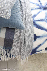
If you’re considering a pastel blue interior for spring, you don’t have to go the whole hog by decorating the walls. It’s easy to get that same fresh, bright effect with blue accessories such as a painted dresser in the kitchen or blue cotton sheets on the bed. When paired with white walls, blue can be added to almost any room to give it that breezy spring feeling.
Let me know what you think of pastel blue as a colour choice for spring and I’d love to hear your tips for dressing your windows in order to get the maximum amount of daylight into your home this season. Please leave me a comment below or tag me @Cassiefairy in your Instagram photos of your room decor.
This article is a sponsored collaboration. The pink links in the content indicate a sponsored link or information source. The blog post reflects my own experience and the sponsor hasn’t had any control over my content 🙂


2 responses
I know what you mean, the colour is fab, isn’t it?!
I LOVE the first picture! never seen bricks/ subway tiles in that colour before!!