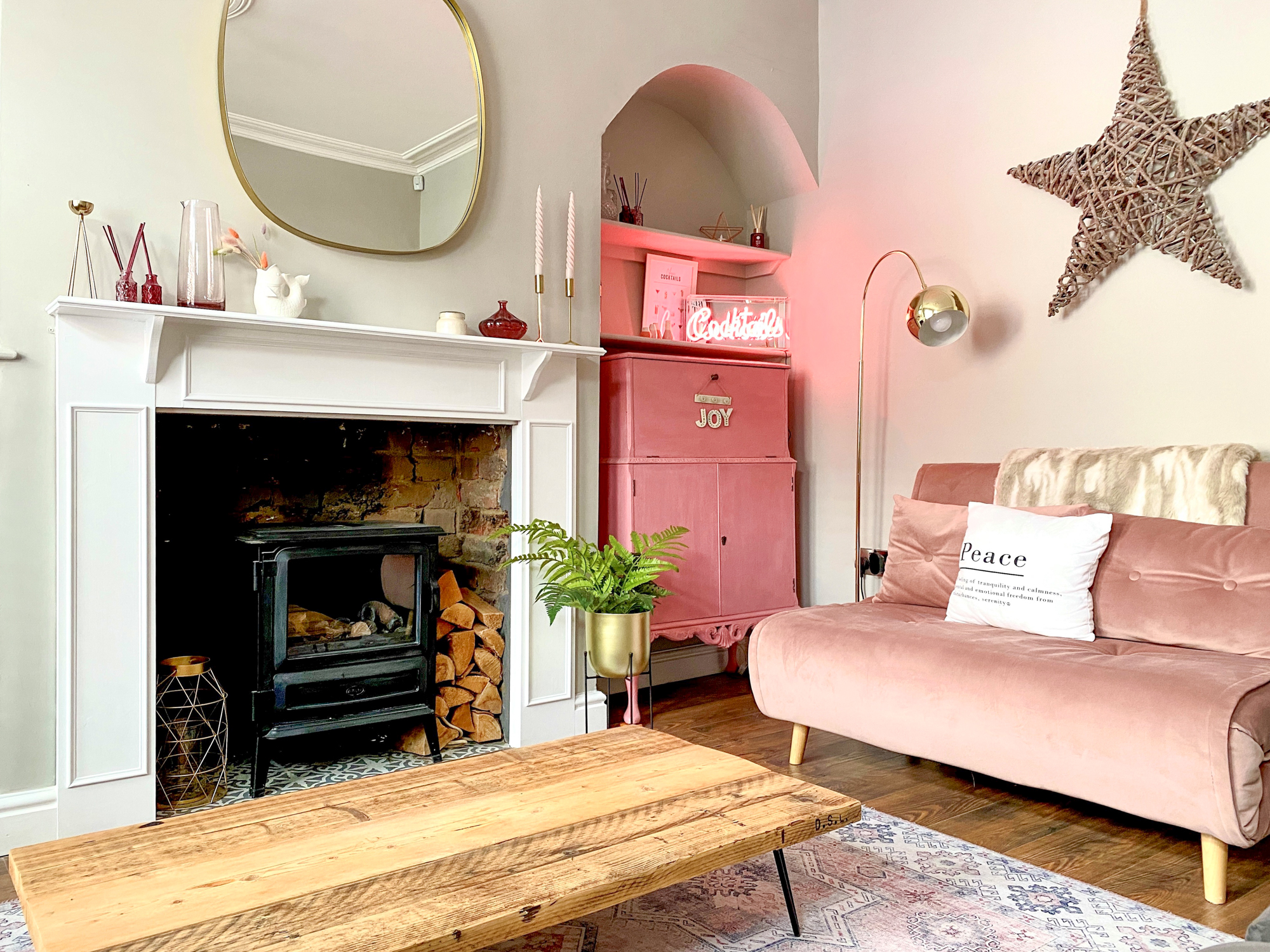
The latest trend in kitchen design is a focus on simplicity and sophistication. A streamlined, contemporary style combined with integrated appliances, thoughtful lighting and a mix of levels helps to keep your room clutter free whilst leaving you more space to relax and entertain.
Opting for clean lines
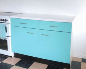
If clean and linear space is what you’re after, coordinated, handleless cabinetry is the style for you. The in-frame construction involved in these cabinets gives them an edge over some flat fronted designs and makes it extremely durable. In smaller kitchen spaces, the absence of handles helps to make a room feel bigger as it prevents an overload of steel handles. If you aren’t feeling the fully handleless look, many popular kitchen designers have created traditional cabinets with a modern twist through dressing them with sleek bar handles and topping cool composite worktops. For added contemporary chic, mix and match styles incorporating flat-fronted wall cabinets.
Keeping it tidy
The key to keeping up that modern kitchen look is to prevent your worktops from becoming cluttered. Whilst we all might want that statement piece of kitchen technology on show, it’s easy for it to escalate. Hiding kitchen clutter, particularly in open-plan kitchens is essential, so plan in plenty of storage with deep pan drawers, tambour units to keep small appliances, crockery and china out of site. Floor to ceiling handleless cupboards can hide a multitude of sins so if you have space, they’re a good investment. Remember, though, for your kitchen to work efficiently, you’ll want easy access to all these things when you do need them, so we recommend siting pan drawers by ovens, larders close to prep areas and china close to the dishwasher.
Work surfaces
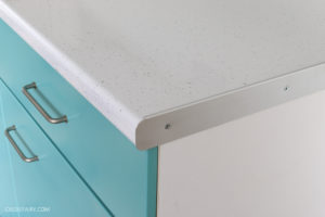
The latest composites found in kitchen design are perfect for modern kitchens as their colour and patterns are consistent. Choice has grown over the past few years to include everything from pure while to zingy orange. Plain white worktops compliment modern cabinetry beautifully but if you want a slightly less clinical feel then manufacturers such as Silestone and Ceasarstone are now producing man-made composites that look like natural materials. Of course, while they can look just like marble or concrete, the real benefit of these surfaces is that they are much easier to look after than natural stones, particularly very porous ones such as marble. They’re also fabulous for creating feature splashbacks – for instance bookmatching a faux marble – with less of a financial outlay than, say, Carrara.
Modern appliances
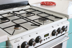
To keep the ‘clean line’ trend throughout the kitchen, it must be followed when purchasing appliances too. If you have your heart set on a range cooker, then choose one of the more modern steel models from Mercury, Smeg or Rangemaster. Integrate as many appliances as you can and if possible, place items such as washing machines and tumble dryers in utility rooms. Keep sightlines clear by installing simple below cabinet, in-ceiling or pop-up extractors rather than fancy hanging pendants, keep fridges and freezers behind closed doors and invest in good-looking, hardworking built-in cooking appliances and a sleek glass zoned induction hob. Finish off with a few modern-day luxuries such as a boiling water tap offered by Quooker, pop-up power points and cool lighting.
4 top tips to follow
- Pick simple surfaces – To keep your kitchen looking smooth and sleek, opt for glass or composite surfaces and large-format floor tiles with matching grout.
- Play with levels – Think about introducing a higher breakfast bar on a kitchen island for relaxed eating. Or how about creating several levels on a peninsula with a raised area to hide the washing-up from guests.
- Go fine – If you choose thinner worktop profiles, it will help your units look more like pieces of furniture. Or you could wrap a composite work surface in a contrasting shade or material around cabinetry on islands and at the end of runs.
- Get creative with lighting – You could use plinth lights to make base units appear that they are floating. Or you could add LED strips of light to the interior of wall cabinets and shelves to highlight favourite kitchen accessories.
Let me know your plans if you’re starting on a kitchen makeover in your own home, and please do share your tips if you’ve recently updated your kitchen – I’d love to hear how you did it and any money-saving ideas you have. Leave me a comment below!
This blog post is an advertisement feature that has been written in collaboration with a sponsor. The pink links in this post indicate a sponsored link 🙂


