MacDonald Gill, known as Max, was a major figure in the graphic art world in the first half of the 20th century. Back in November I visited an exhibition of his work at The Lettering Arts Centre completely by accident and I was fascinated by the maps on display. The exhibits were a recent discovery, found in a cottage in Sussex which had been Max Gill’s last home, and until then his work has gone largely neglected. I’d never heard of the designer until I stumbled upon this exhibition and I am so pleased that I stuck around to listen to the talk about his life and work.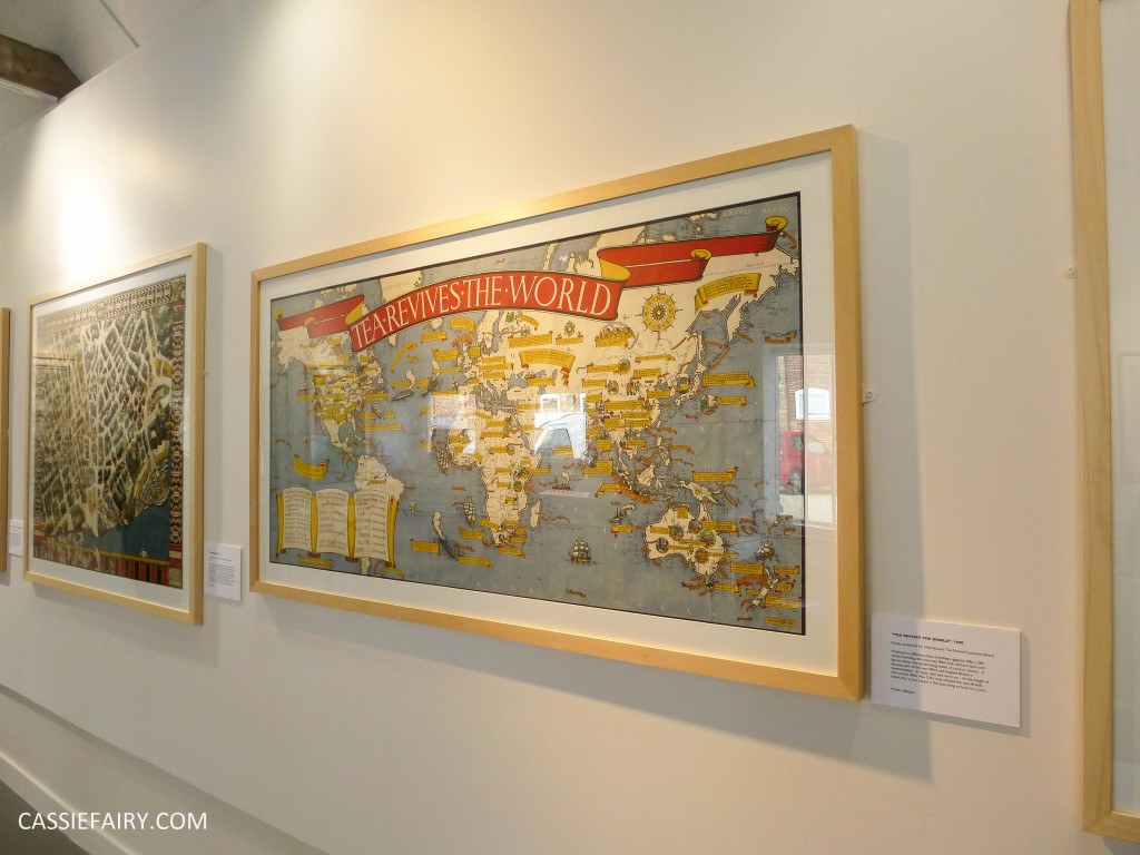
 The one thing that you may know Max Gill for is his famous lettering work. The Imperial War Graves Commission appointed him to design the lettering alphabet and regimental badges for the standard military headstone after the first world war. This standard script is still used today and can be found on military memorials all around the country – a small yet very visible success for this little-known cartographer.
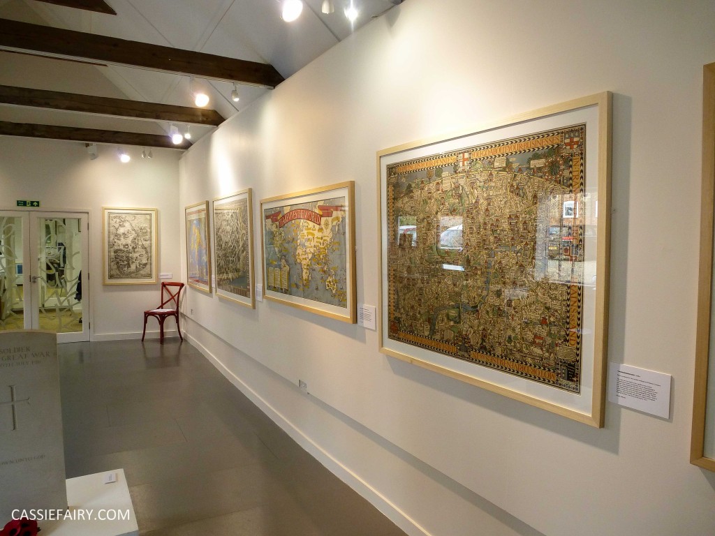
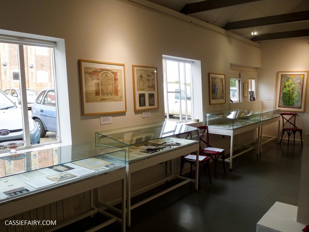 It was his maps rather than his lettering that really sparked my imagination and I spent hours browsing the posters he’d designed. The muted colour palette was beautiful; each map was a gorgeous combination of mustard, denim blue and burnt red – all my favourite tones – so I was immediately drawn into the work and was compelled to take a closer look.
The influence of William Morris’ Arts and Crafts tradition on Gill’s work was evident through the hand lettered calligraphy and minutely detailed artwork of each map. There are so many elements within each piece that it was hard to see it all, and I didn’t want to drag myself away until I’d read every fact and spotted every ‘joke’ image within the map. 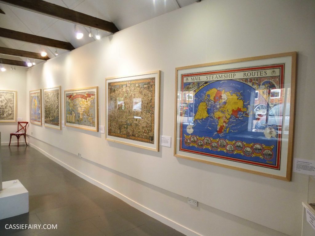
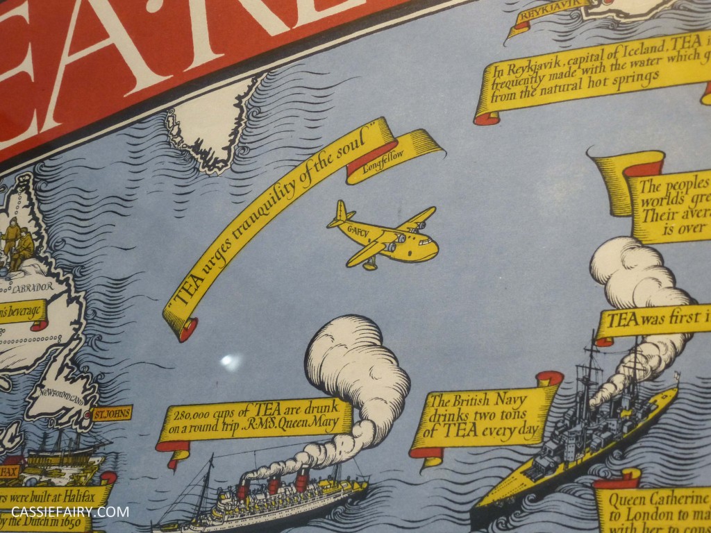 Many of his maps poked fun at new technologies and world-wide progress. Having been born in the Victorian era of horse-and-carts Max Gill would make comment on new developments by including comic images alongside the detail of the map; such as a broken-down bus being pushed by its passengers when motor transport was introduced, which I am sure would have made his fellow Victorians roar with laughter when they came across it while studying the map. In 1920 a magazine reviewer said of Gill “He is always looking at things from a queer angle, but in the most natural manner in the world without affectation. There is a sort of jolly exuberance about all the work of this notable artist-craftsman.”
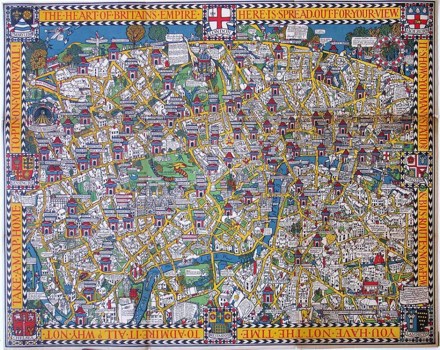 Wonderground Map image at MacDonaldGill.com
One of Gill’s most famous maps was the Wonderground Map of London Town which was a decorative version of the London tube map. It was commissioned by Frank Pick of the London Underground as ‘entertainment’ for passengers and, when it appeared on underground station platforms in 1914, commuters regularly missed their trains because they were too engrossed in the comedy of the map! Can you imagine that happening today?!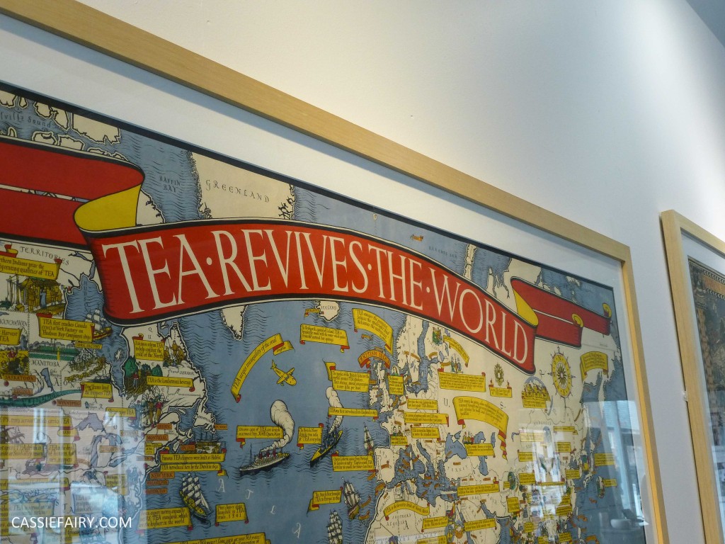
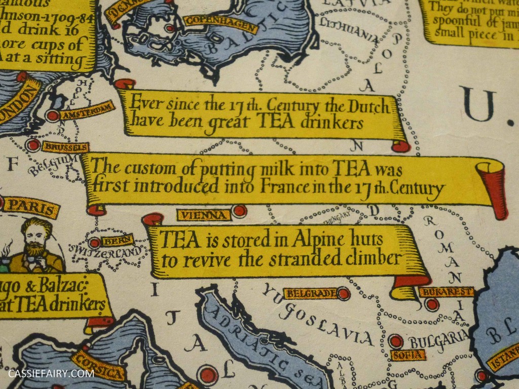
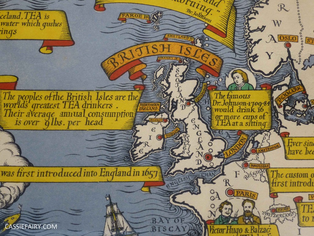
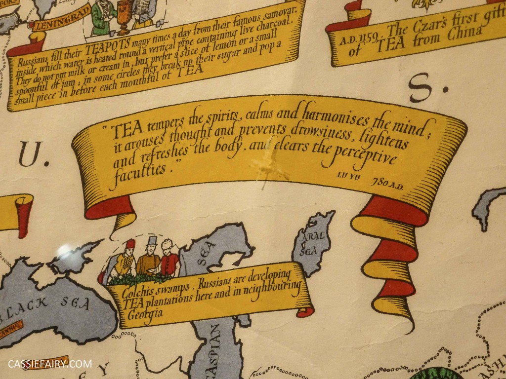
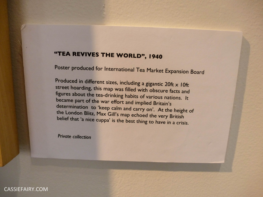 The maps that I studied most during my visit to the exhibition were Gill’s collection of tea maps. He helped to promote the British tea-drinking habit by creating a series of maps showing where tea is grown and how its popularity has spread throughout the world. The facts on this map fascinated me and I photographed a few parts of the map so that I could look back at it when I got home. It reminded me of a map of Lancashire that I’d been sent by the Lancashire Tea brand after collecting tokens on their boxes of teabags – I’ll have to dig this out and show you it soon!
I really enjoyed the exhibition and I’m so please that we popped into the Lettering Arts Centre that day. The talk about Max Gill’s life really stuck with me and I’m pleased that I took some photos at the time so that I could recount the exhibition to you today. At the time I didn’t even know I was a map geek, let alone admit to it and have a regular feature on my blog!


