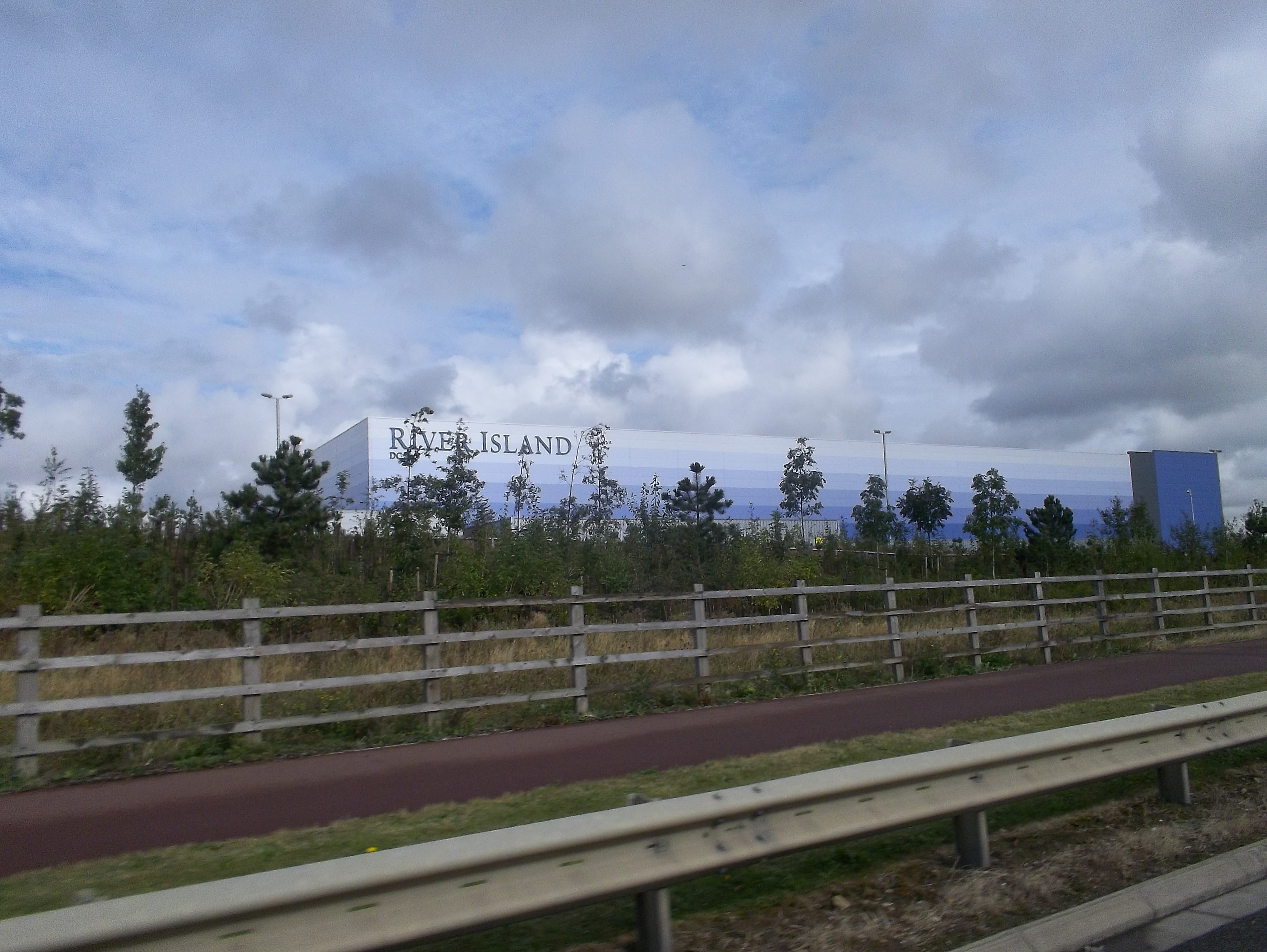
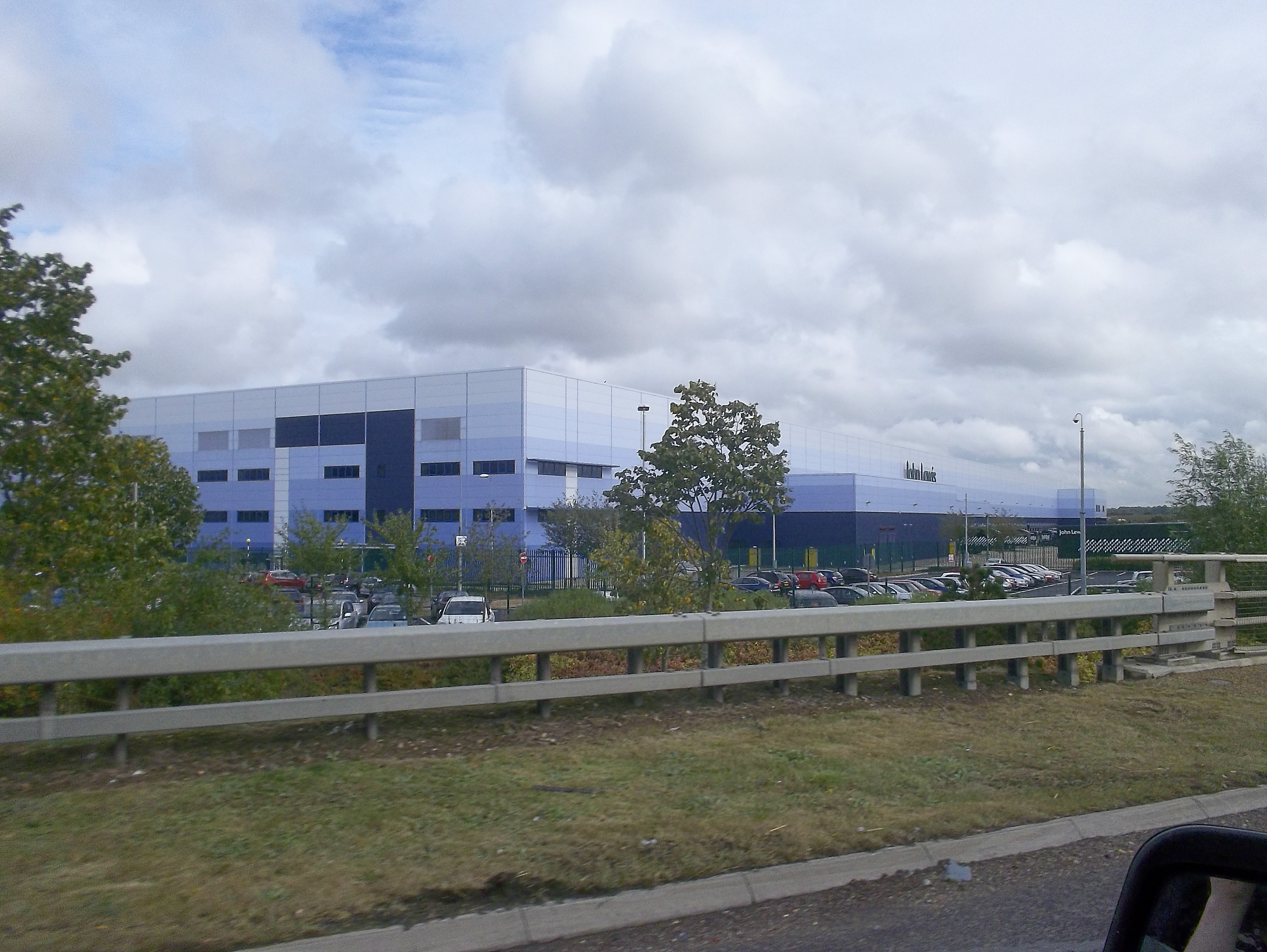
I saw this fantastic design for industrial buildings recently when I was on my way back to Suffolk from Buckinghamshire and the faded blue coloured walls really caught my eye (or not, as the case may be!).
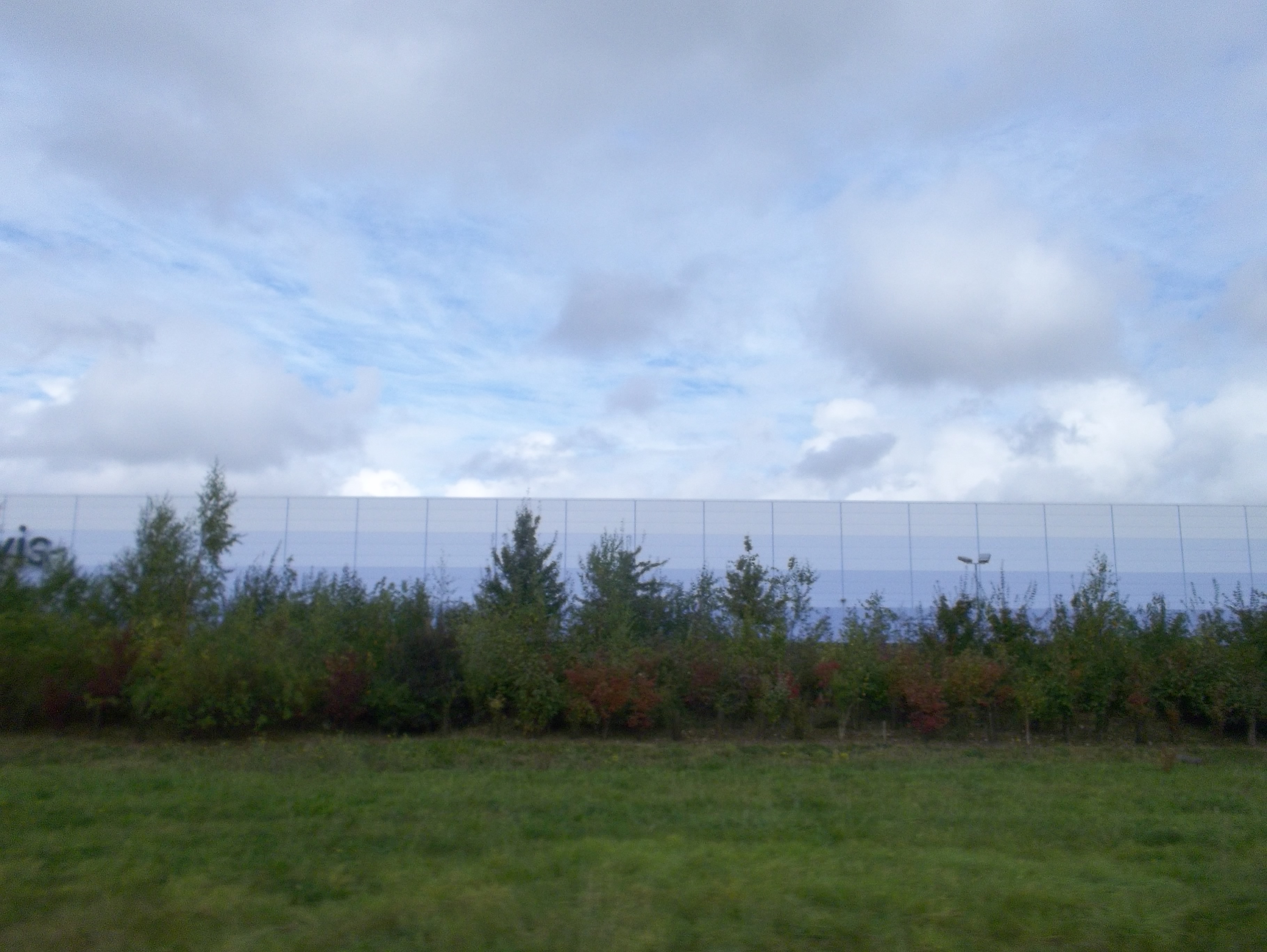
These colossal units are the John Lewis and River Island buildings which I think are alongside the A1. The sides of the building are coloured in blue which is graduated from deep blue to a very light, almost white blue, which on the day that I saw them, matched the colour of the sky almost exactly.
I really like this clever design for making what could have been an eyesore practically disappear into the landscape – how simple that a gradient of a colour would cause such a significant difference to the appearance of the buildings.
 Have you ever seen any kind of colour gradients used in architecture before? Please get in touch, I’d love to see more examples of this kind of design effect. Maybe this could be an effect I could use myself to disguise our new shed when we finally build it in our back garden to make it less noticeable… hmm I think I will investigate more!


