Today I wanted to share a really interesting article that I stumbled across last week. I asked designer and artist Chris Ramensky whether he would be willing to share his tips on interior design with you and he kindly sent over a guest post on the biggest (yet most common!) mistakes that people make with their home design. I know I’m guilty of some of these things and I’ve already made a few changes to my home after reading this. By simply taking out a few items I’ve made more space, and a new lampshade has made a world of difference in my living room. I hope you too will be able to gain some inspiration for your own home and please let me know what you think by leaving me a comment below.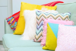
Being acquainted with the basics of interior design can help create an organized and tranquil space while generating a sense of order and balance at the same time. It’s not surprising really that there are a lot of rules as far as interior decorating is concerned however, small tweaks here and there can help you avoid some of the biggest mistakes people make with interior design outlined below:
Over-furnishing a room
You don’t have to have a lot of space to turn your room into a well-planned, sleek looking living space. A room should never look or feel cramped. You should design your room in such a way that there is enough space to create movement and flow. At times it is not even a matter of too much furniture, but more of its placement. Most people do lay a lot of emphasis as to where they are placing their furniture, thus end up making their rooms feel smaller than they actually are. If you move a piece or two and your space still feels tight, consider removing it altogether.
Poor lighting
Lighting is an imperative element of design. While you want to have good lighting for reading, the lights should be selected for specific tasks or to create a particular mood. Walk into most rooms that have not been professionally designed and you will most certainly notice that lighting and fixtures do no not match the function of space.
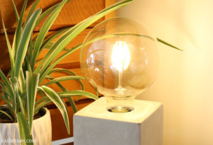
Poorly placed curtains and accessories is another interior design mistake that is regularly made, consequently blocking natural light sources. Rooms should have as much lighting as possible. Natural lighting can be enhanced by placing mirrors directly across the source so that the light can bounce back around the room. Equally, dimmers should be installed to allow total light control on all light switches.
Not having enough variety
It may sound appealing and convenient, but you should avoid buying your stuff from the same store or source. The essence of interior design is to have everything coordinating yet a well decorated room has dimension and personality, and this is almost impossible to achieve this if everything looks the same. Variety is what makes your room unique while striking a balance between colours and every other component of the room.
Hanging artwork and mirrors at the same height
Most people tend to stick to the hanging art eye level rule to a point of forgetting that people’s eyes are not of the same level. They tend to forget about that 6 foot person that will walk into their room and have a propensity to concentrate on the person sitting on the chair. To avoid this, hang your artwork and mirrors in such a way that there is a focal point on the wall and enhance your space while you are at it.

Decorating with the current trends even if it doesn’t match your décor
Who doesn’t want to be up to date with the current trend and styles? However, when it comes to interior design, the rules change a bit. In a much as you want it to look modern, your rooms are not the place to be “fashionable” season in season out. To avoid spending too much money in a bid to “keep up with the trend”, consider interior decorating designs that will outlast the trends and still look appealing for a long time. If it is a must that your room stays on trend, look for ways to slot in new styles into your décor without making a total overhaul by keeping the colour palette neutral and simply changing accessories and soft furnishings.
Authors Bio: Chris Ramensky is an Australian artist, specialising in digital graphics and interior design. He completed his masters at the University of NSW. Currently Chris is the wall mural curator at Home Store Online. Chris hopes to one day have his work featured within the Australian National Gallery.
This blog post is a guest post advertisement feature. The pink links in this post indicate a sponsored link 🙂




One Response
This was a great post to read from some fantastic tips! I’m already trying to use some of these points and rearrange my room! Thanks for sharing 🙂
Pop over to my blog!
Sarah
https://everydayconcepts.wordpress.com/