With the changing seasons, I always feel a desire to look around my house and adapt the space to suit the time of year. Now that autumn has arrived, there’s nothing I want more than to feel cosy and comfortable in my home. Textures add to that feeling, but it’s colour that I tend to focus on the most, which is why I’m exploring how my favourite mid-century colours create a feeling of cosiness…
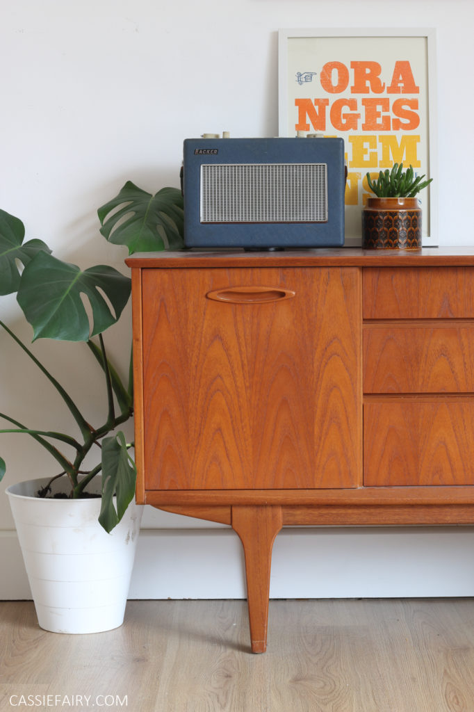
If you’ve read my blog before you may have spotted that I’m a bit of a mid-century modern fan. In fact, most of my furniture is from the sixties and seventies, and even our dinner plates are my nan’s hand-me-downs from the fifties. I can’t help myself; whenever I consider changing the decor of my home, I head straight for the secondhand shops to find something retro.
Why? Because I believe it gives your home a cosy vibe in a way that no other era can. Maybe it’s nostalgia; I’ve probably seen these mid-century pieces many times during my childhood in my parent’s and grandparent’s homes. Maybe that’s why the colours, patterns and designs from the middle of the last century have such a comforting effect on me. Plus, the warm wood of teak furniture and parquet flooring never looks sterile or cold.
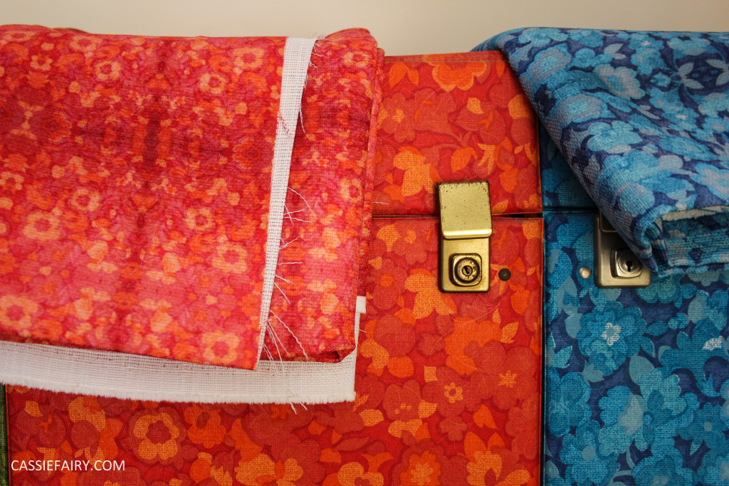
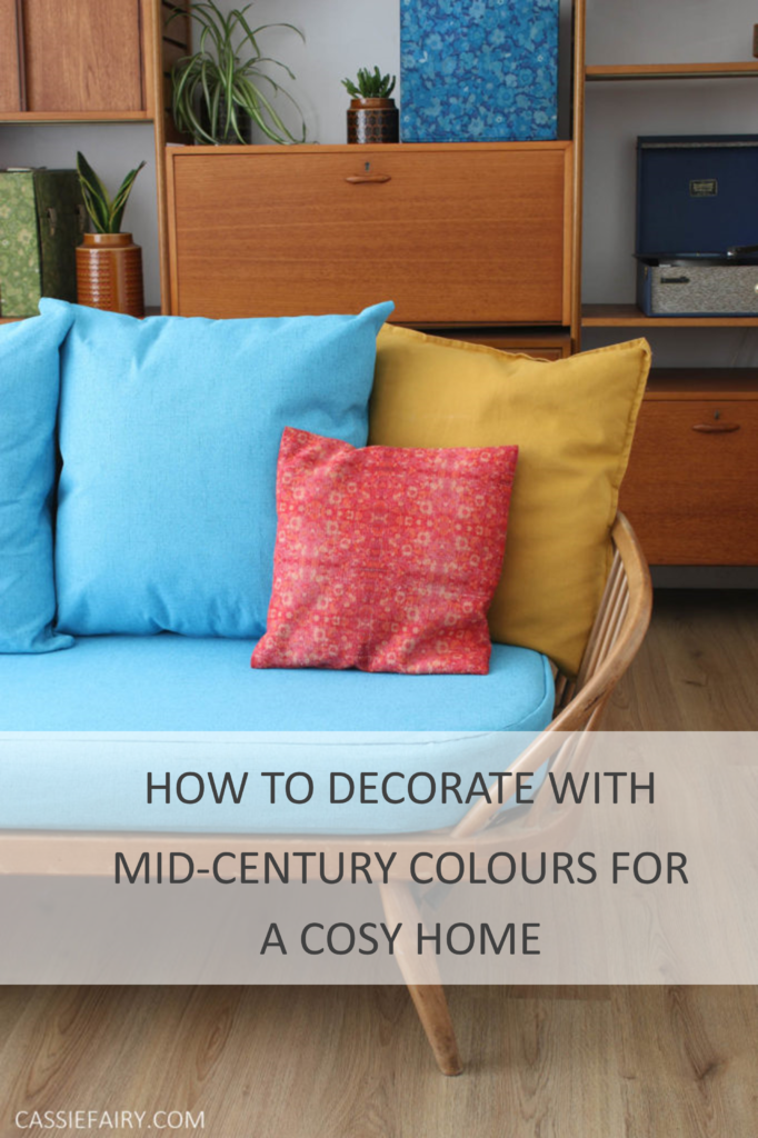
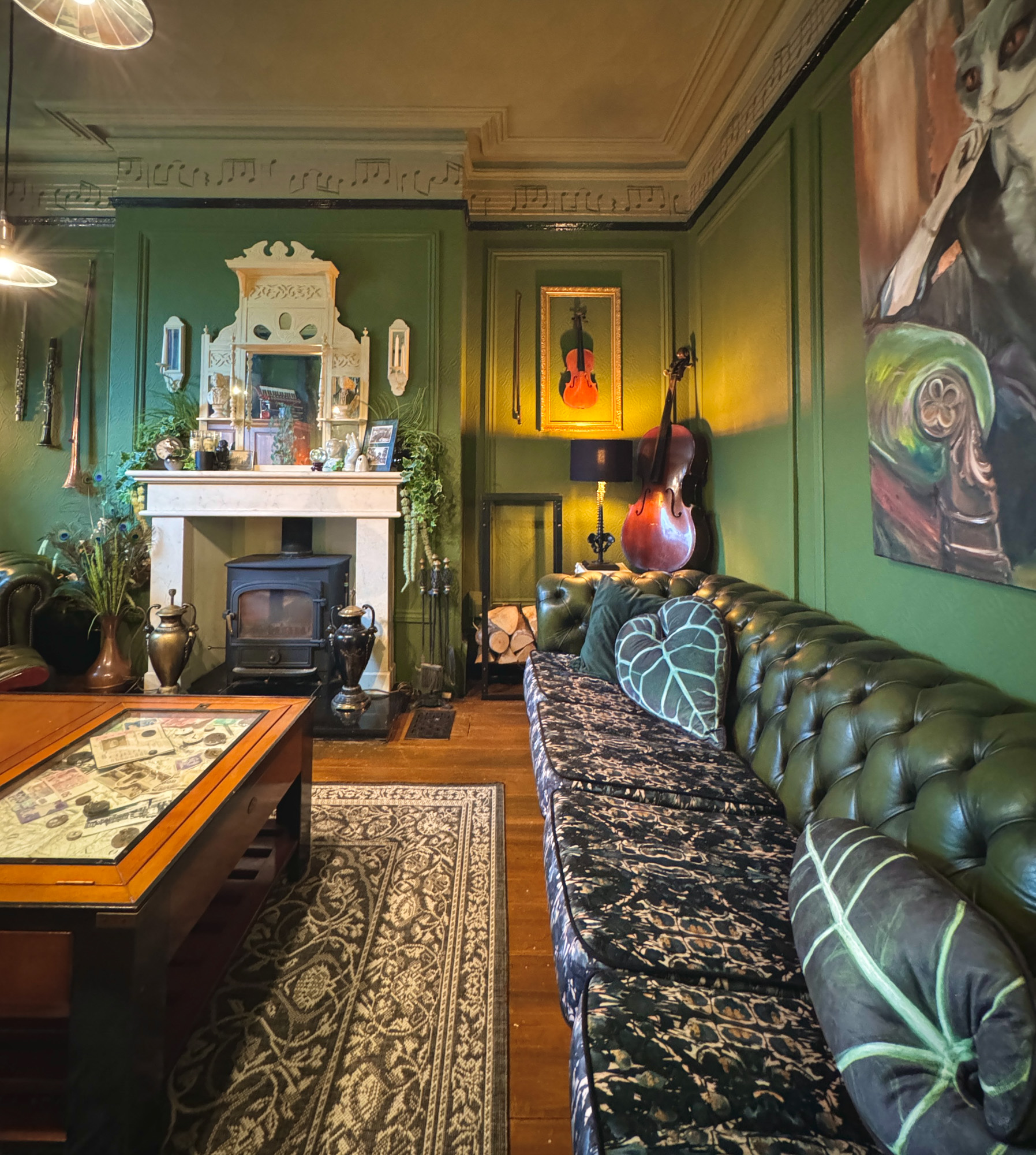
But I don’t think it’s just my personal experience that makes the mid-century style feel homely. Even the most contemporary home can feel welcoming and familiar by simply painting the walls in mid-century colours or adding cushions in playful vintage patterns. Just a glimpse around my living room and you’ll spot three of my favourite mid-century colours; orange, mustard yellow and aqua blue. These shades work year-round to make a space feel cosy.
ORIGINAL ORANGE
I know that orange might sound a little ‘too much’ but I can reassure you that matt paint finishes and contemporary formulas ensure an orange wall is more about injecting warmth and cosiness rather than bold colour. With autumn arriving and winter looming, what better time to paint your walls in a warm hue?
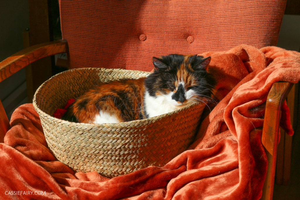
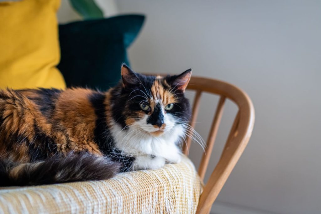
It’s the same shade as the mid-century teak furniture I love, so it creates a lovely tonal effect in a room with retro storage. Plus, orange seems to be the colour of the season, thanks to pumpkins. And is there anything more autumnal than a calico cat in a woven basket on a rust-coloured blanket, draped over an orange G-Plan armchair?
AQUA BLUE
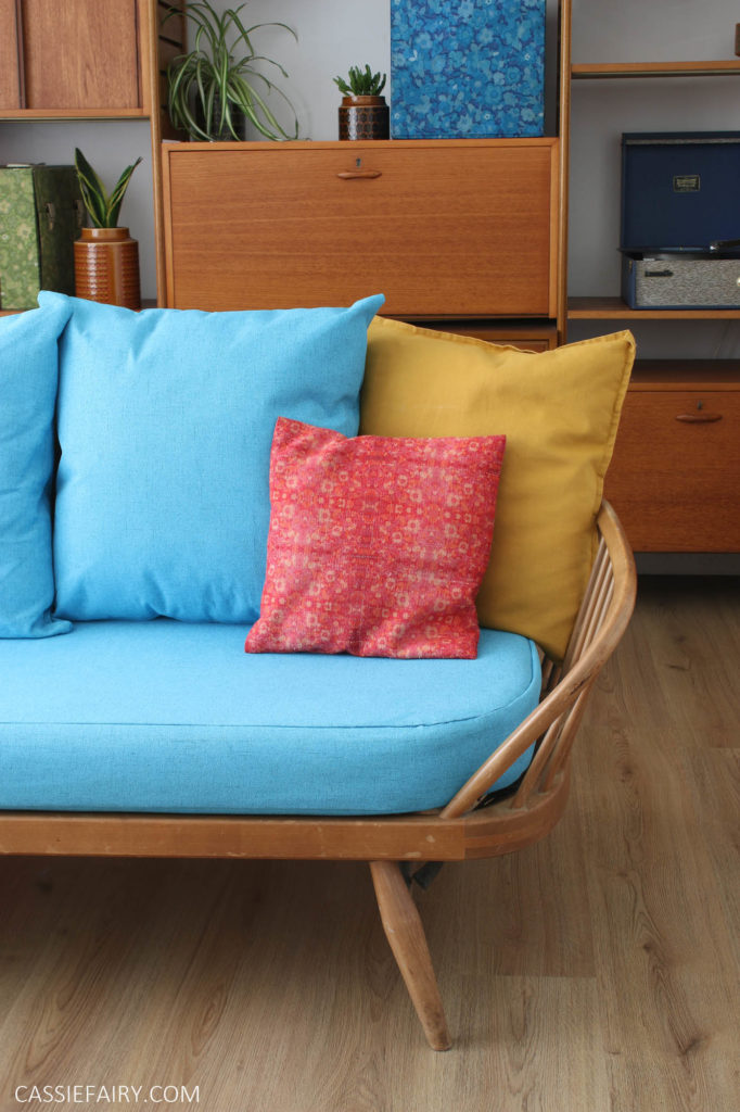
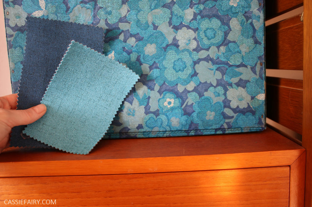
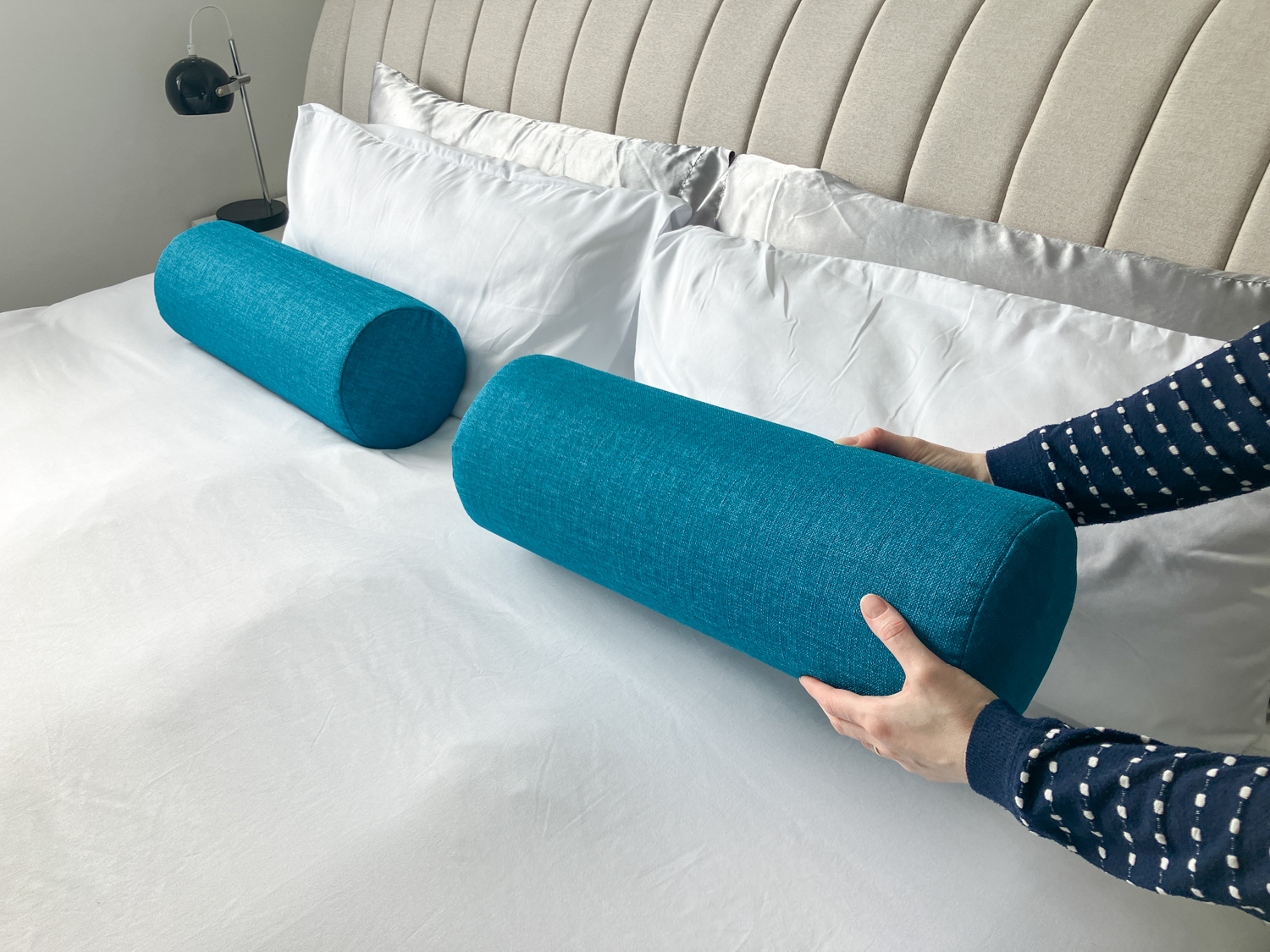
Alternatively, you could always use the teak furniture itself as an orange accent colour against an aqua or teal blue wall. This is my favourite ever colour combination, which is why I made aqua blue covers for my Ercol day beds. It makes both colours seem richer and more vibrant – the warm teak wood pops against the cool blue tones and vice versa. Teal blue is an easy-to-live-with shade as it’s neither too bright, nor too cool, nor too warm. As Goldilocks would say: it’s just right.
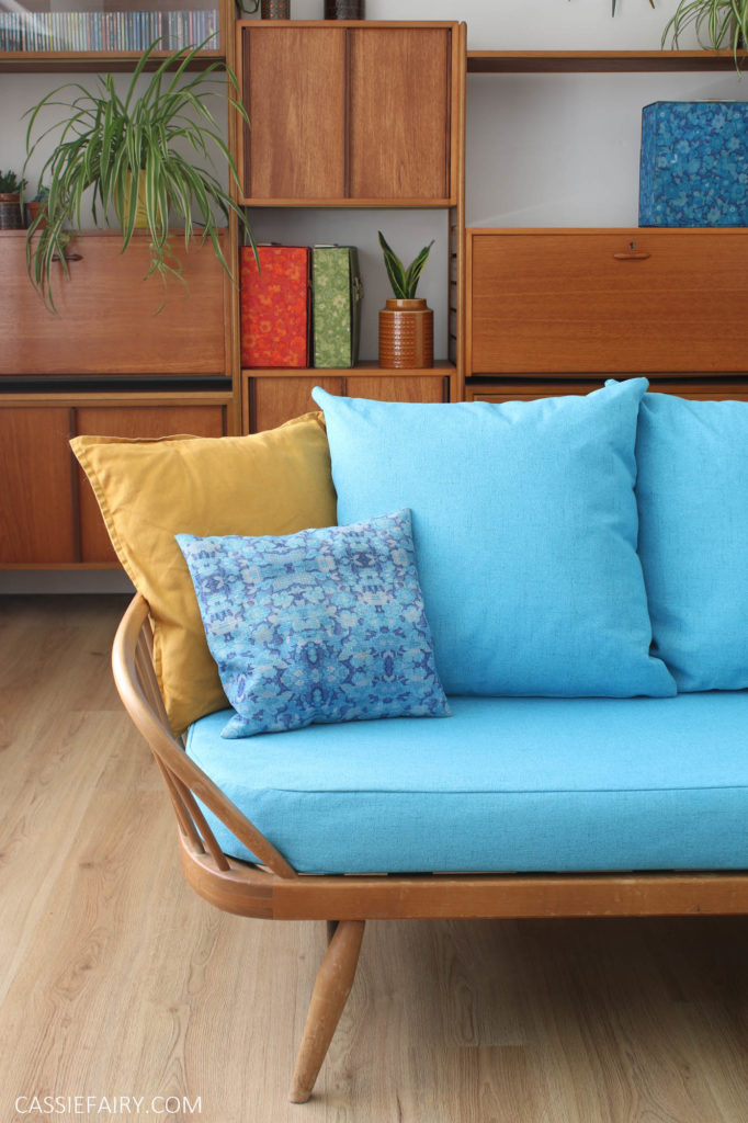
I would go so far as to say that teal blue goes with any kind of wood, from original parquet wood flooring in oak tones to contemporary Scandi-style birch wood chairs. So really, there’s no excuse not to include a teal or aqua blue feature wall in any room of your home.
MUSTARD YELLOW
It’s buttery, rich and warm. I love mustard yellow. This tone is easy to live with year-round; it adds sunshine in the winter, brings freshness to spring spaces and lets lush green houseplants take centre stage in the summer. At this time of year, it’s the ideal backdrop for layers of knitted blankets in russet shades on squishy sofas. Plus, it looks great with the contemporary grey sofas and chairs we all have in our homes at the moment.
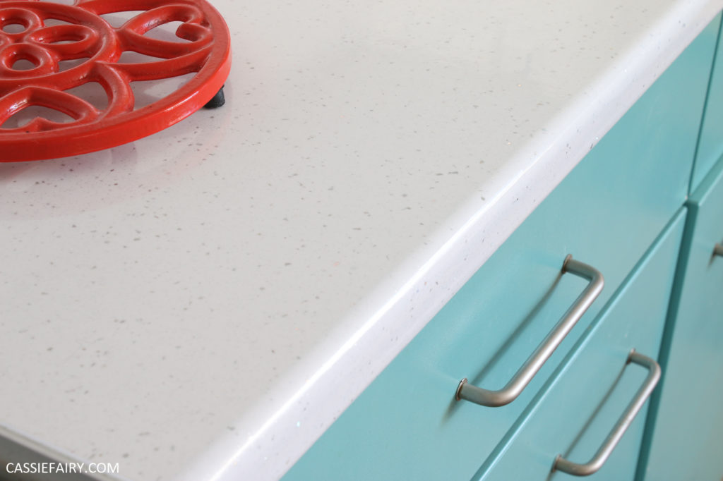
Personally, I am yet to add any coloured walls to my home. At the moment all the colour comes from my accessories and artwork but I plan to add feature walls in my living room and kitchen soon. I’m still deciding which of the three colours to use, although I think the orange or mustard will look best in the kitchen against the fifties-style turquoise cabinets. Watch this space!
Let me know your favourite vintage colours and let me know if you decide to go for it and decorate in a warm mid-century hue this autumn. I’d love to hear about your projects so please leave me a comment below.
PIN IT FOR LATER












One Response
Love this colour palette! The vibe is perfect for curling up at home during the Fall 🙂