After blogging for 10+ years, I’ve made some very definite decisions on how I want to run my ‘little corner of the world wide web’. When I look back over the years, I sometimes cringe at the posts I wrote, the photos I took and the design of my site, but it was all a lovely learning curve and I really enjoyed the process of developing my own website. Me? A web designer and programmer? Who’d’ve thought it?!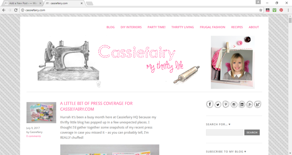
Anyway, I’m still not 100% there with the design of the website – I’m sure there are plenty of ways I can make it look and perform better – but I’m okay with it looking like a good ol’ fashioned blog. I’m not a glossy magazine, am I? So there’s no need for me to try to recreate that Cosmopolitan/Pop Sugar/A Beautiful Mess style that I love. I’m just a normal blogger with a little happy-go-lucky website and that’s certainly good enough for me.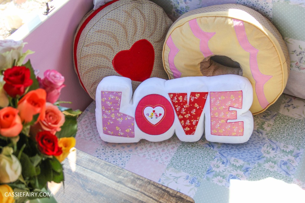
Plug it in
I’ve tried to add plug-ins to make my site a little easier to navigate around. The change came at the start of this year when I realised that my old blog posts were really difficult to find. Well, noone wants to be scrolling back through pages and pages of posts, do they? So some of my best content – the projects I was most proud of – were hidden away in a long chronological blog roll. So I popped a few navigation buttons inside each category and hoped that would help you discover some more of my posts. Do me a favour: click around the DIY Interiors category and let me know how you get on.
What a mess
The only thing with this new addition was that many of my previous posts didn’t have featured images. As recently as last year I was sharing full posts on my blog rather than excerpts, so I didn’t have a need for featured images. It seemed fiddly to have finished a blog post and then have to create a small thumbnail image to feature. So I didn’t bother (so lazy). But when I added my new category buttons and lists of posts, there was a lot of empty space on my website, argh!
Crazy featured images
So I used another plug-in to set featured images on all my previous posts. It worked like a charm – in fact, a little too well. The plug-in chose the first image of every post as the featured image, even if it wasn’t the right size, resolution, orientation or appropriate to the content. Sure, I could go through all the old posts and set my own images but you’ve already heard how little time I have so, for now, you may find some far-too-big featured images on a post. Just scroll past and ignore it please.
So disorganised
I’d love to be one of those organised people who create pinnable images with text, who have enough time to schedule social shares so that every blog post seen by everyone on Twitter, or to actually share ‘new post’ videos on my Instagram story. But what you actually get instead is landscape photos that don’t look great on Pinterest, one measly ‘I blogged’ tweet, and a boomerang of my cat rolling over.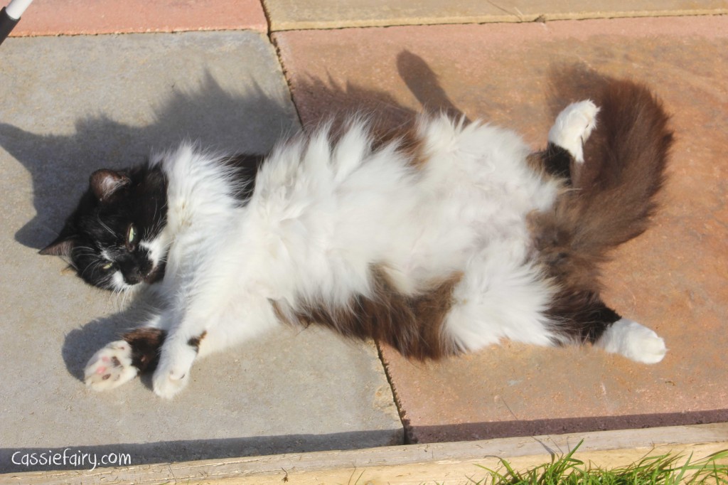
One good thing
One good thing I’ve done this year is create a proper mobile theme for my blog. I’m actually almost proud of it. If you look at Cassiefairy.com on a smart photo there’s a whizzy rotation of recent posts, jazzy excerpts in my blog roll and it’s pretty easy to navigate around. One small victory – and I’m definitely not got to do anything more with it for now. If it ain’t broke, don’t fix it.
That time it broke
Which brings me nicely onto the time that I broke my whole website earlier this year. Can you imagine the terror when I changed a teeny tiny bit of code and the whole site stopped working? And because it had broken, I couldn’t get back into it from my end to put it right. There was a frantic day of discussions with my hosting provider, the Jetpack team (thank for goodness for backups – that £2.80 per month doesn’t seem such a waste of money now, does it?!) and a lot of weeping at my end before the website was back up and running. Not quite as good as before, but it was there – phew.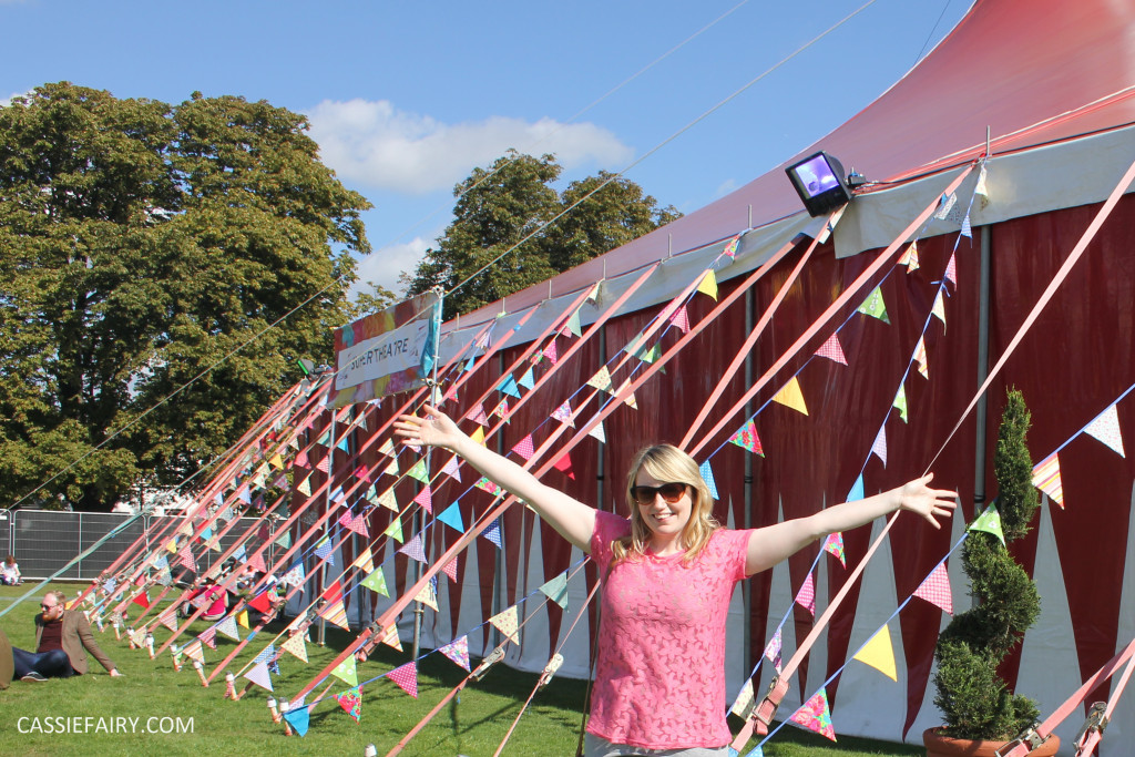
I’m planning to change things a little this year, so please bear with me if you come to Cassiefairy.com and find a right ol’ mess one day. It’ll be better the next day, I promise! Let me know how your blog or website has developed over time and please share your tips for making mine run better by leaving me a comment below. Just don’t ask me to change any coding, eek.












5 responses
Ooh that’s good to know – got away with it again, haha! Thanks Becky 😀
I can totally relate to the horror of when you ‘break’ your website. Everytime I even run an update I panic! It’s so funny hearing that you look back and cringe because from an outsider looking in, your whole blog looks totally professional and so impressive!
Aw thank you so much Bry – I hope so too! x
I love your blog and it’s style – Let’s hope you’re blogging for another 10+ years!