I was lucky enough to interview US-based Kate Pearce for Reclaim magazine a couple of years ago in 2020. Despite being in the midst of the pandemic, Kate’s vibrant interior and choice of happy colours made me feel really upbeat and I’m hoping that you’ll feel the same as you take a tour of her mid-century style home.
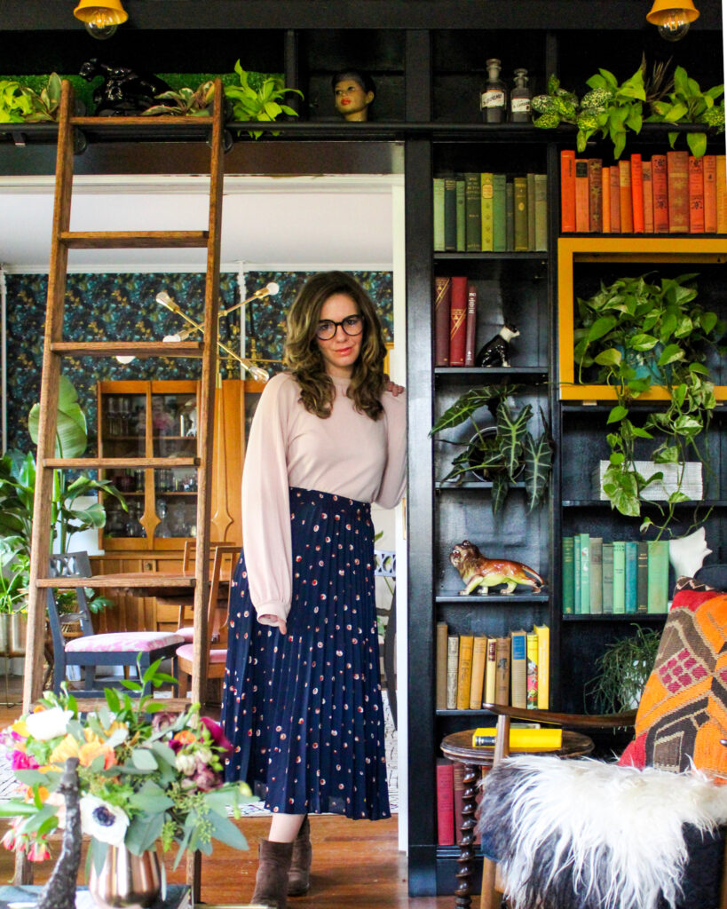
I first discovered Kate through her Instagram account @katepearcevintage. I love reading her blog to learn more about her home – including the new interiors she is designing for her latest home. Kate’s a big fan of sourcing secondhand retro pieces, so she also has an online shop where she sells a curated offering of vintage goods.
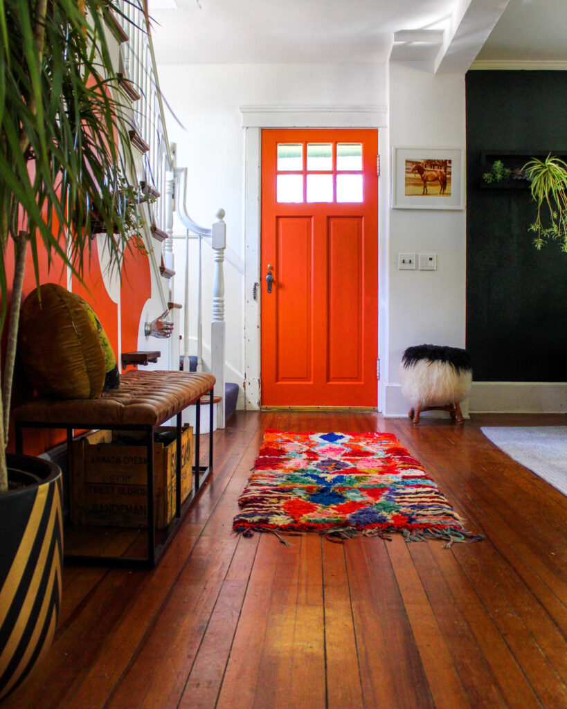
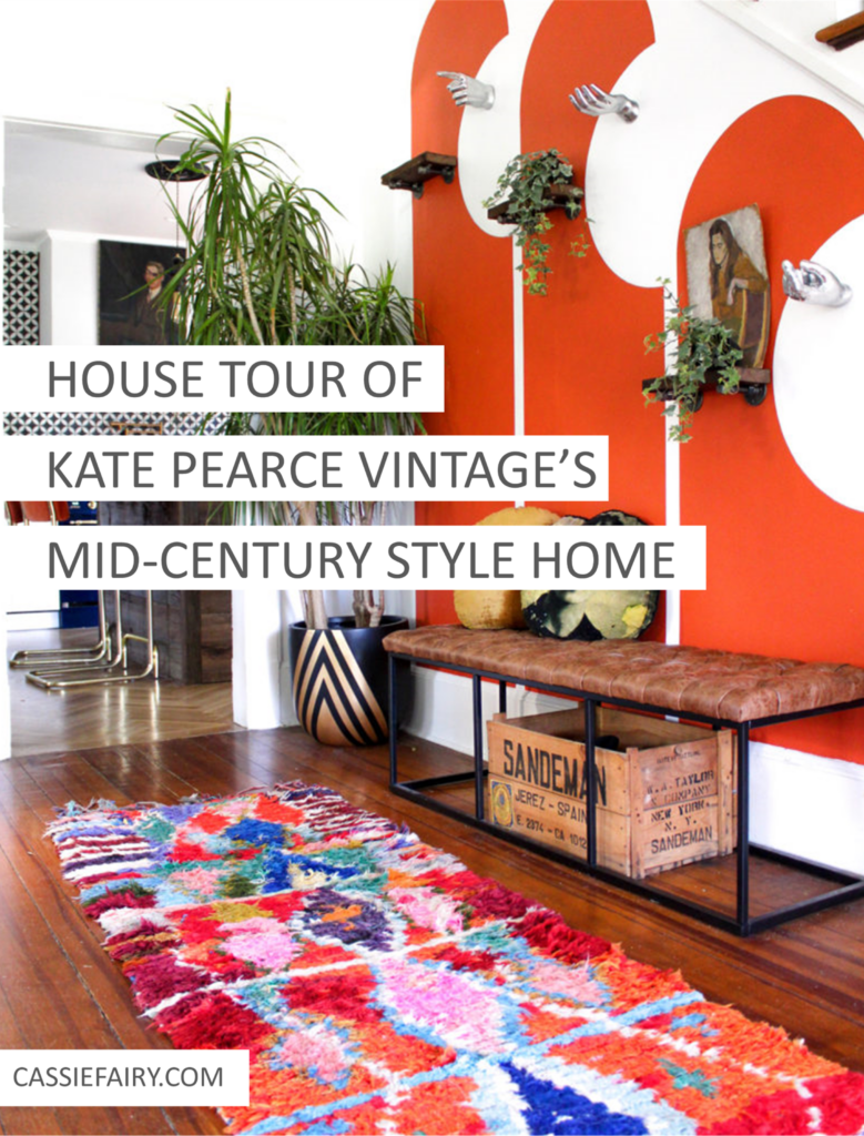
We begin the home tour in her hallway – one of the most colourful parts of Kate’s home and the location of her curved wall mural. I’ve previously featured this design in my blog post of 8 incredible wall murals by creative homeowners, so there’s no doubt that I love this element of Kate’s home.
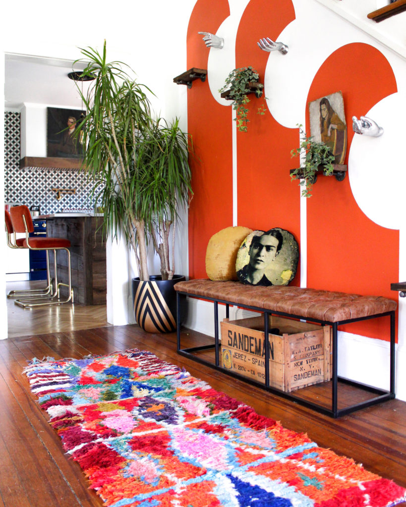
The retro design is painted in the same shade of orange as the front door, which is Farrow & Ball’s Charlotte’s Locks. It gives the space an instantly mid-century feel and I would like to recreate this look in my own home to achieve that vintage vibe.
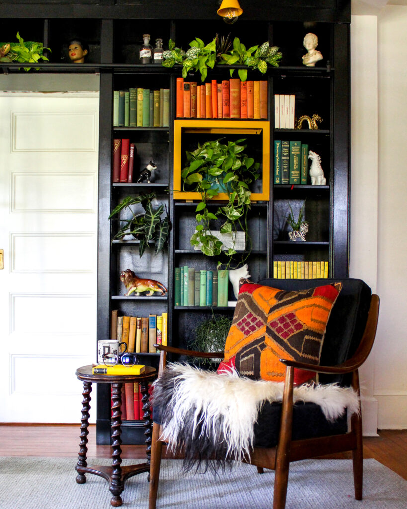
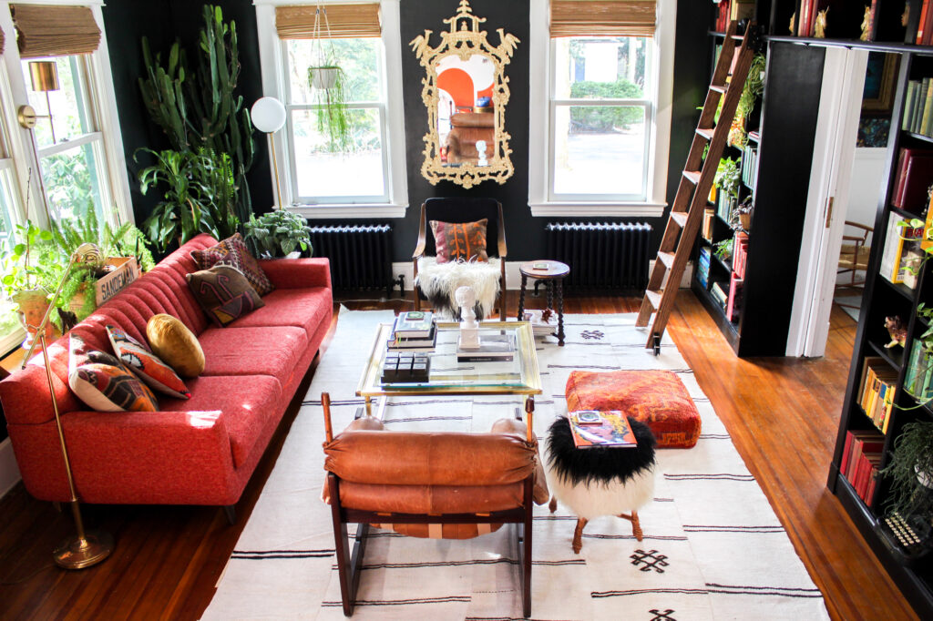
The hallway leads into the main living space in Kate’s home. The living room features a library wall with lightboxes for growing house plants to create that indoor-outdoor feel. It’s painted in Farrow & Ball’s Studio Green for a lovely relaxing feel.
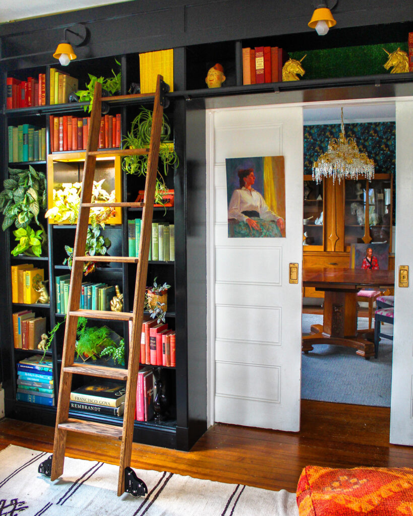
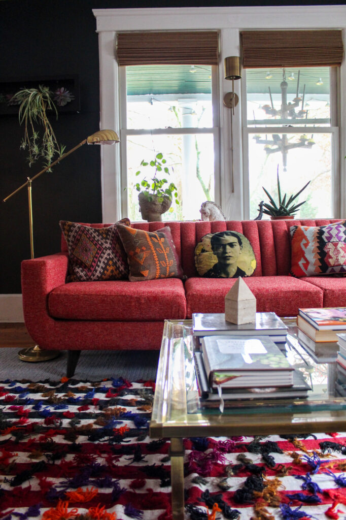
Her use of colourful Persian and Moroccan rugs and woven cushions on the sofas give the space a cosy feel, just right for snuggling up in the autumn. I’m inspired to use more pops of colour in my own home after seeing the yellow and orange details in this room.
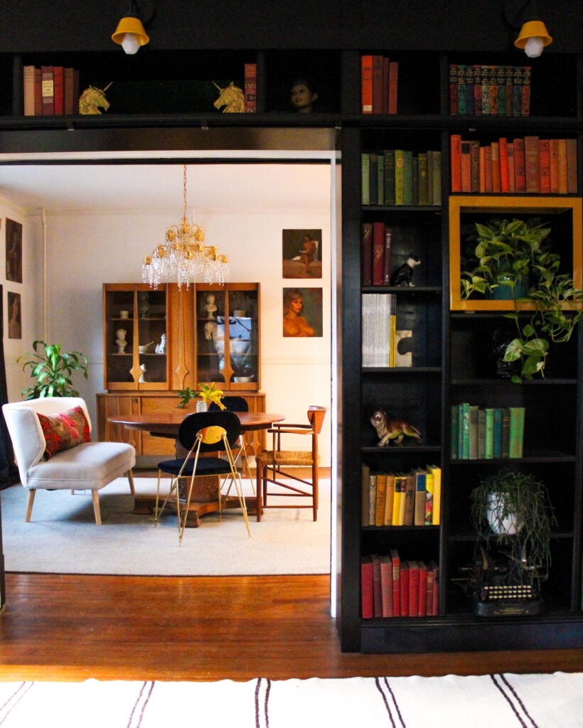
The double doors open into the dining room – a space that’s packed with authentic mid-century pieces and a mix-and-match set of chairs around the antique dining table.
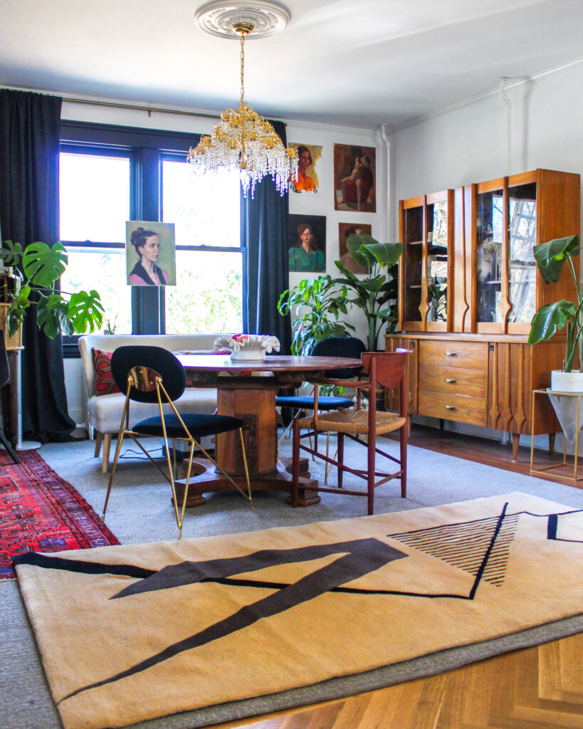
Kate refinished the parquet wood flooring when she moved into the property and has protected it with layered rugs that also bring pattern to the space. Her collection of artworks are by artist Sanford Kossin and Kate was lucky enough to pick up a selection at an estate sale.
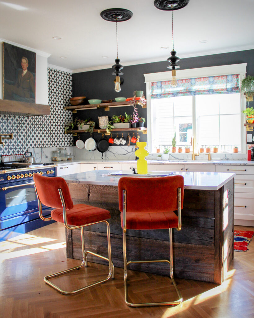
The dining room is open-plan and links to the classic white kitchen. In this space, colour is used to connect the kitchen back to the living spaces, such as the stools in rust-orange velvet and popping accessories.
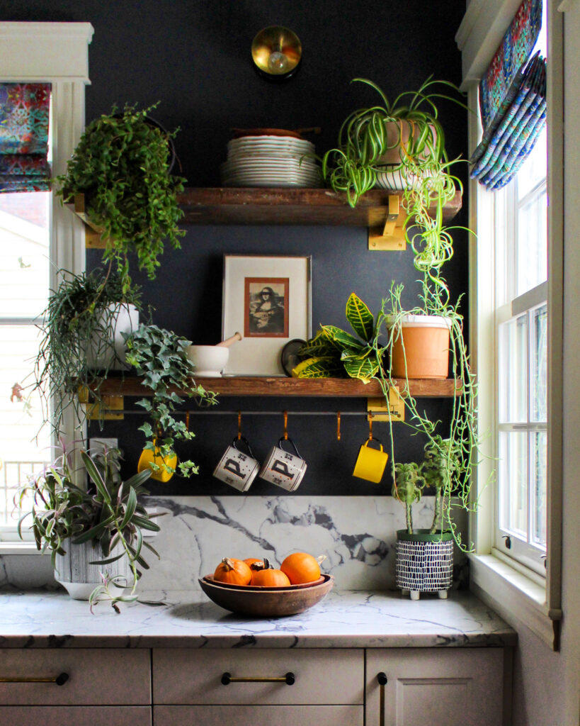
Likewise, plants on the open shelving in the kitchen echo the grow boxes in the library wall and keep that natural feeling running throughout the house.
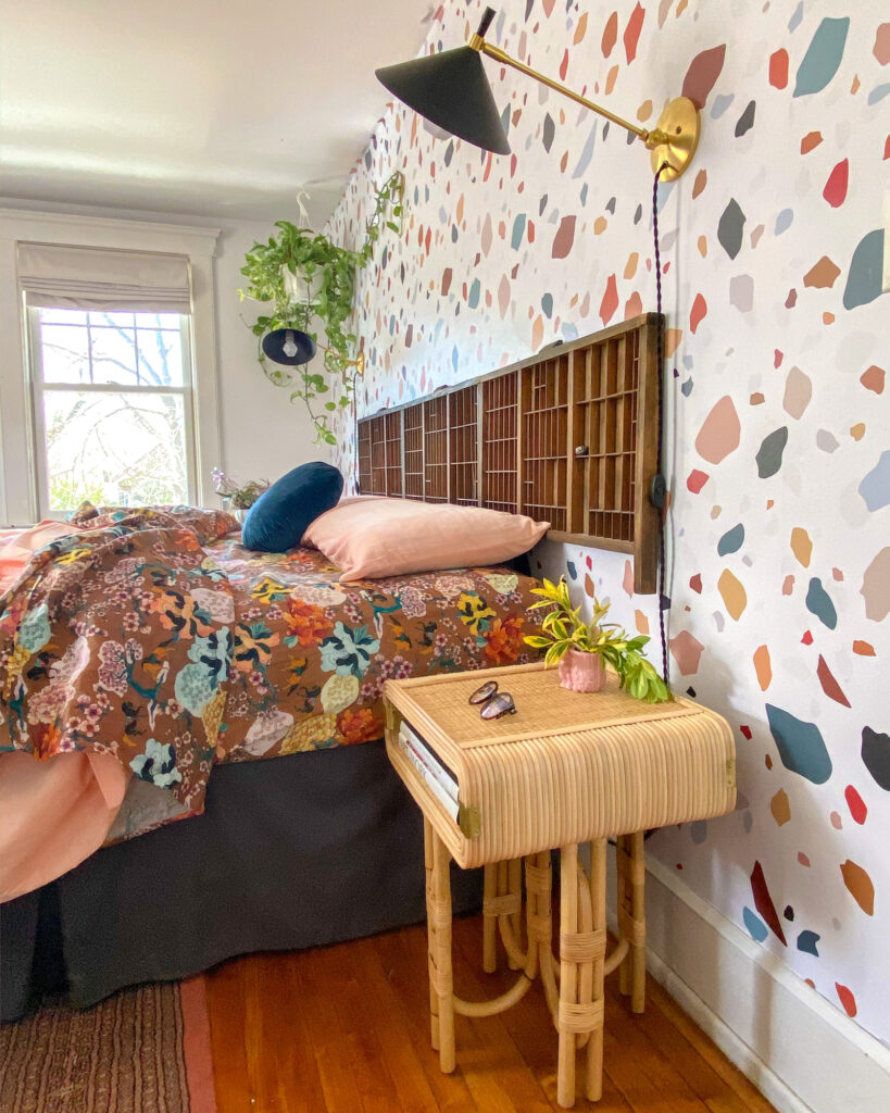
In the bedroom, terrazzo wallpaper and printed linens clash for a riot of playful pattern. It creates a truly happy-feeling space and is something I would like to replicate – we could all do with a little more colour and pattern in our lives, couldn’t we?!
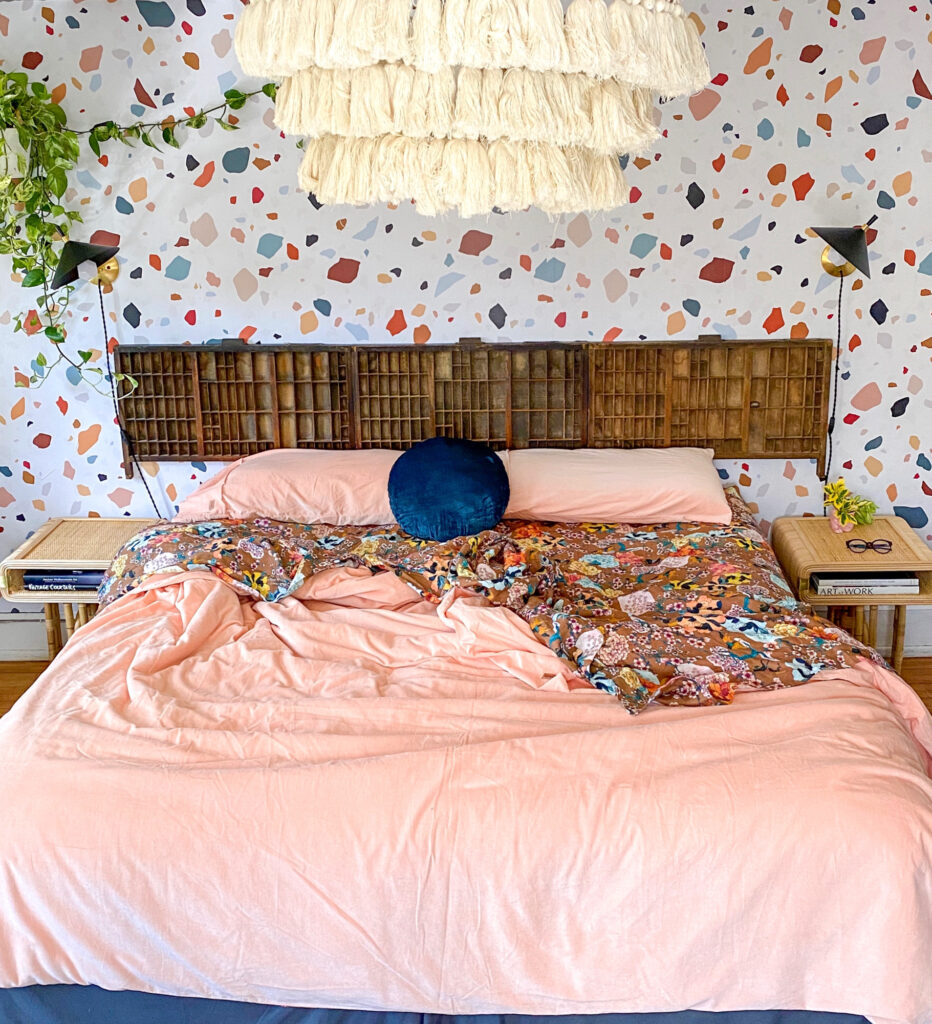
Kate made her own unique headboard using antique printers’ trays. She mounted the wooden boxes on the wall across the width of the bed to bring a natural feel and vintage vibe to the otherwise rather contemporary room.
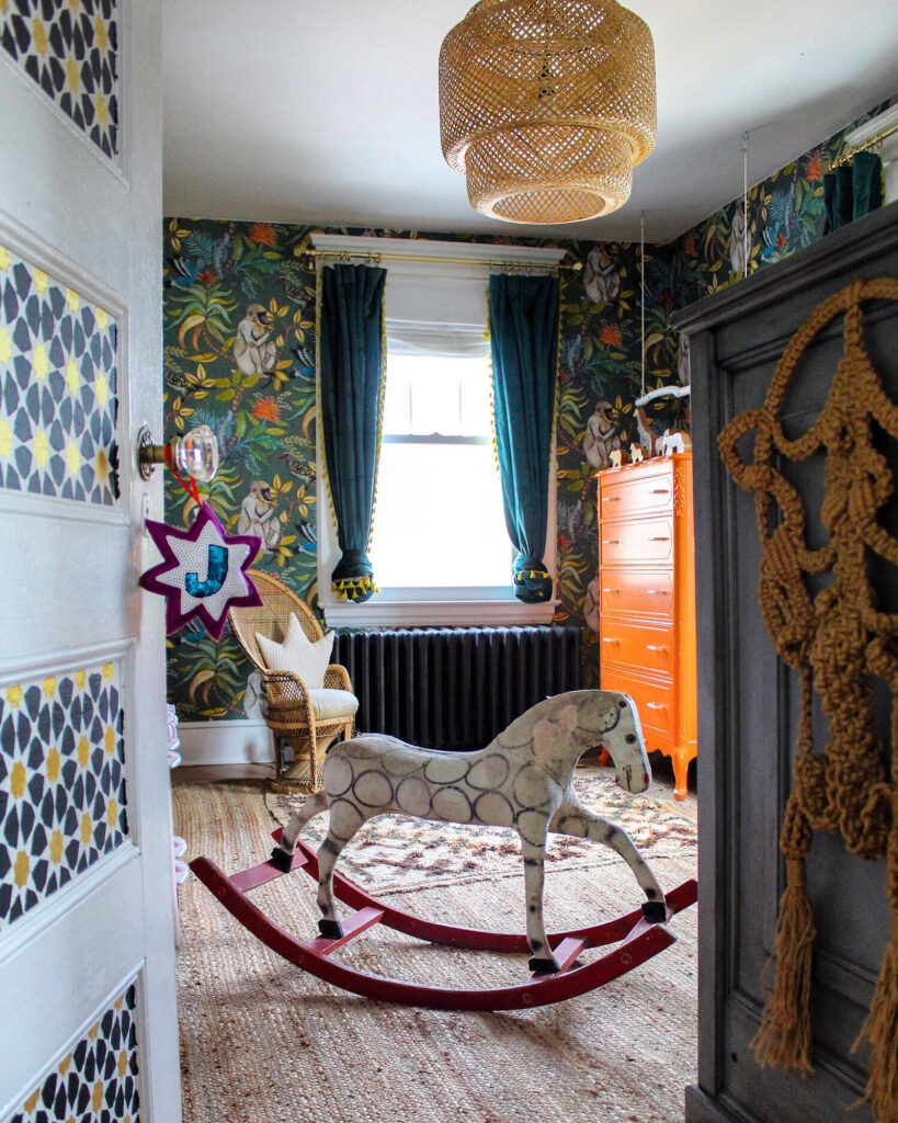
Finally, here’s a quick peek into Kate’s children’s bedroom. She has decorated the walls with a fun Cole & Sons jungle-themed wallpaper – surely, the ultimate pattern to help little ones’ imaginations run wild. Kate upcycled the chest of drawers herself, using her signature orange paint to revamp the thrift-store piece.
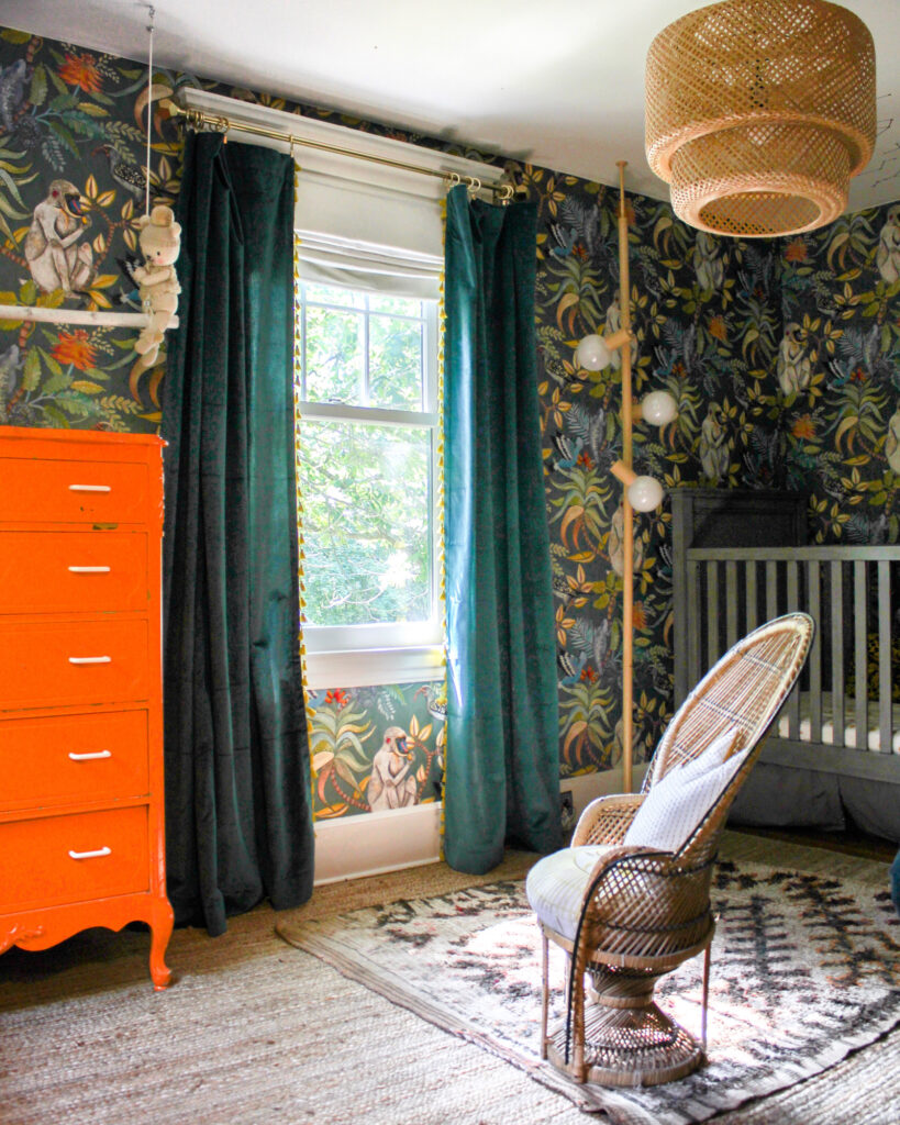
I hope you’ve enjoyed this tour of Kate Pearce’s Long Island home. I personally love all the mid-century touches and have been inspired to add more colour to my own interior – especially those pops of autumnal orange! Let me know what you love about this creative house in the comments below and be sure to follow Kate on Instagram @KatePearceVintage. If you’d like to read more about Kate’s home, you can pick up the back issue of Issue 51 of Reclaim magazine here. 🙂
Pin it for later
