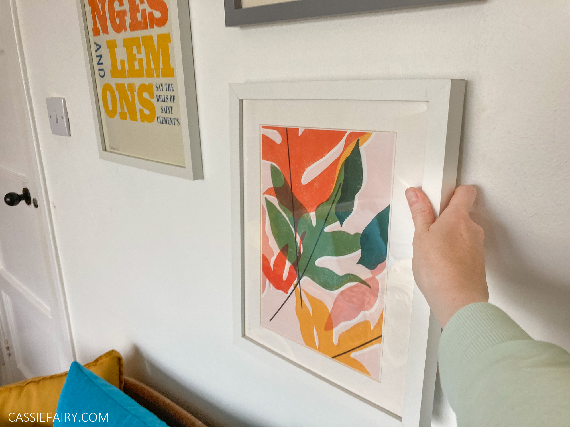
I hope you remember that, for most of last year, I have been working on the decor of my living-room of my new home, and although its taken ages (due to limited funds and time-consuming bargain hunting!), its nearing completion. Here’s the link to my mood board if you’d like to see what kind of style I’m aiming for. So with the furniture sorted, the soft furnishings in place and even artwork chosen, I am finally sorting out the walls.
Choosing a colour or pattern for your walls is the most significant decision in interior design, as it will be the first thing that you will notice about your room, either bringing all the elements together to complete your theme,or be completely wrong and make you want to move. So, even though a lick of paint is probably easier (and certainly simpler to change if it’s not right) my retro living room needs some garish patterned wallpaper as was traditional in the 60s and 70s era that I’m trying to replicate.
Throughout the process I’ve chosen bright oranges and browns and now is not the time to chicken out. So I’ve looked at some old 70s photos to get an idea of the (albeit kinda garish) patterns and colours of the decade, which will influence my choice of wallpaper for my living room.
I realised that I don’t want an oversize pattern and I couldn’t cope with clashing combinations of bright orange, green and yellow. Nor would I like a dark, oppressive brown or striped pattern, both of which would make my already-small living room appear even tinier. Finally, a pet peeve of mine is anything floral (soooo noughties) so nothing too ‘pretty’. So I’ve picked out a few modern wallpapers that I can get my hands on that I quite like and spent sometime comparing samples and imagining what each would look like on one, two or more of the walls in my living room.
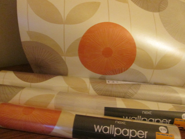
And I’m pleased to say that I have made my choice – this lovely Monroe wallpaper below from Next. It’s kind of shimmery so it reflects the light and doesn’t make the room appear smaller. Most of the circles are muted, neutral shades of beige and brown, apart from the juicy orange accent colour. I also really like the Orla Kiely-esque leaves in the background of the pattern. Luckily, when I went to Next to purchase the paper, it was in the January sale and so, at only £6 each, I bought every roll on the shelf ! So my next weekend challenge is to get the room empty and start papering – and in the meantime I’ll have to decide which walls to paper!
Related articles
- Interior design inspirations for a retro home: Office space (cassiefairy.com)
- Have you ever seen anything more retro than this? My new record case
- Inspirations for a retro living room: Soft Furnishings (cassiefairy.com)
- Interior design inspirations: Finn Juhl
- buy lamp shades online
