Earlier this week wrote about the start of my West to East holiday, which kicked off in Blackpool over the Valentine’s weekend. I shared photos of my long awaited trip to The Blackpool Tower Ballroom and the amazing seafront hotel that we stayed in – if you missed the post, please check it out here. 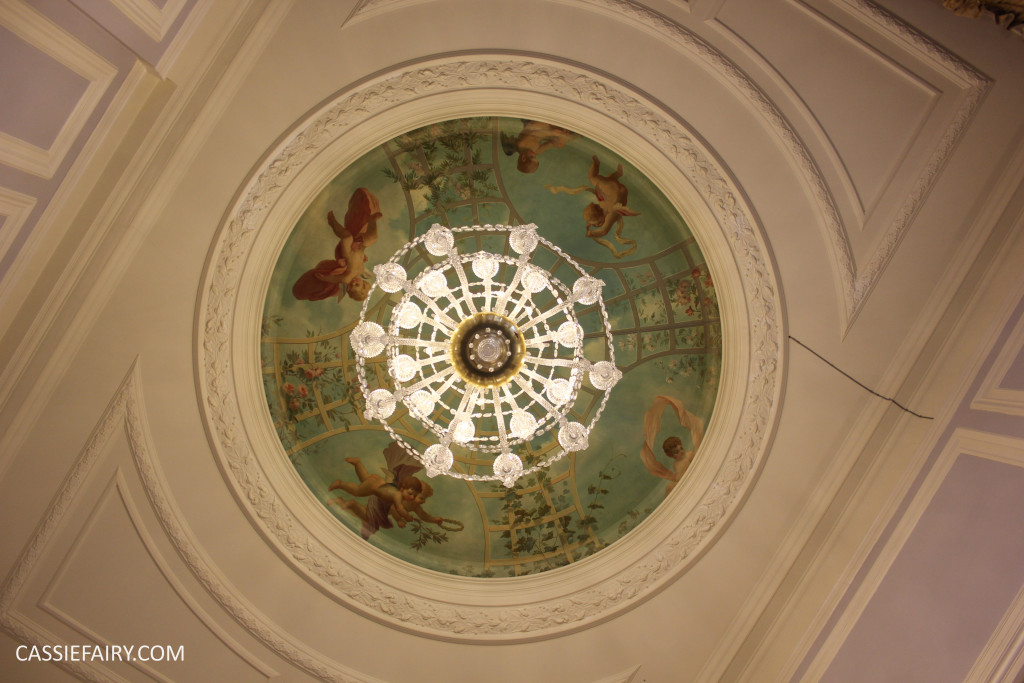 Today I’m simply bursting to share more about my trip with you and, in particular, the design details of the gorgeous hotel we stayed in while visiting Harrogate. I gained so much interior design inspiration from The Majestic Hotel that most of my photos of this leg of the trip are of wallpaper, tiles, colours and patterns, so I couldn’t resist writing an article about luxury decor today.
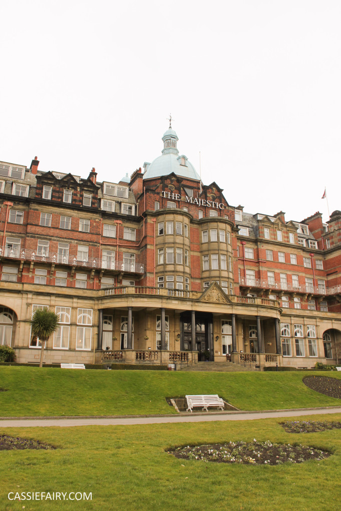
To start with, I want to tell you a little about the history of The Majestic Hotel itself and how it has developed over the years into its current incarnation as part of luxury accommodation group The Hotel Collection.
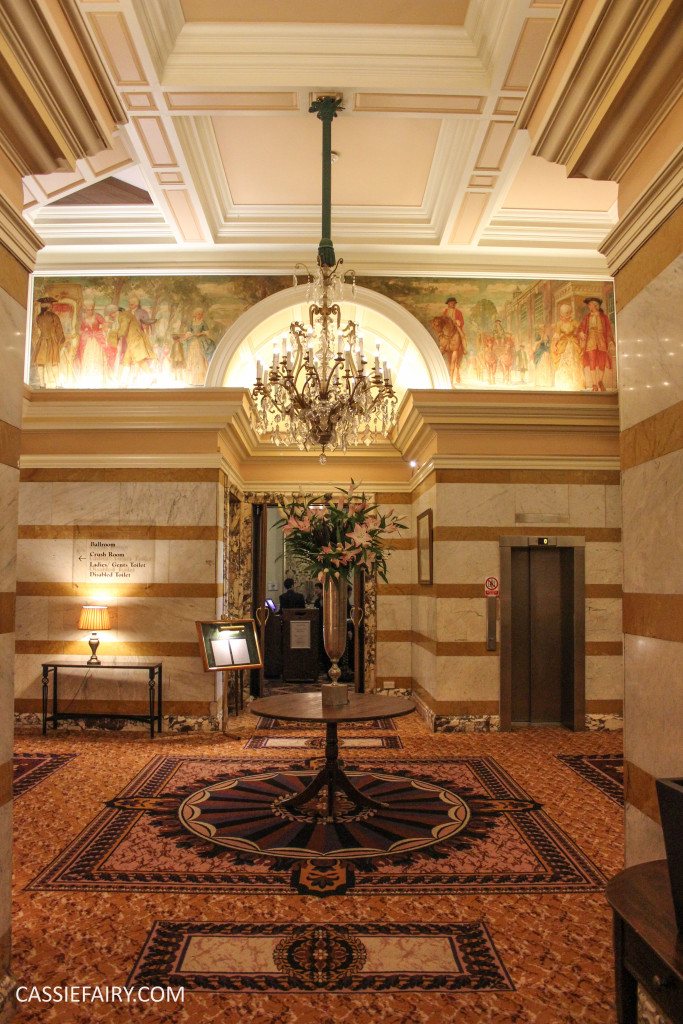
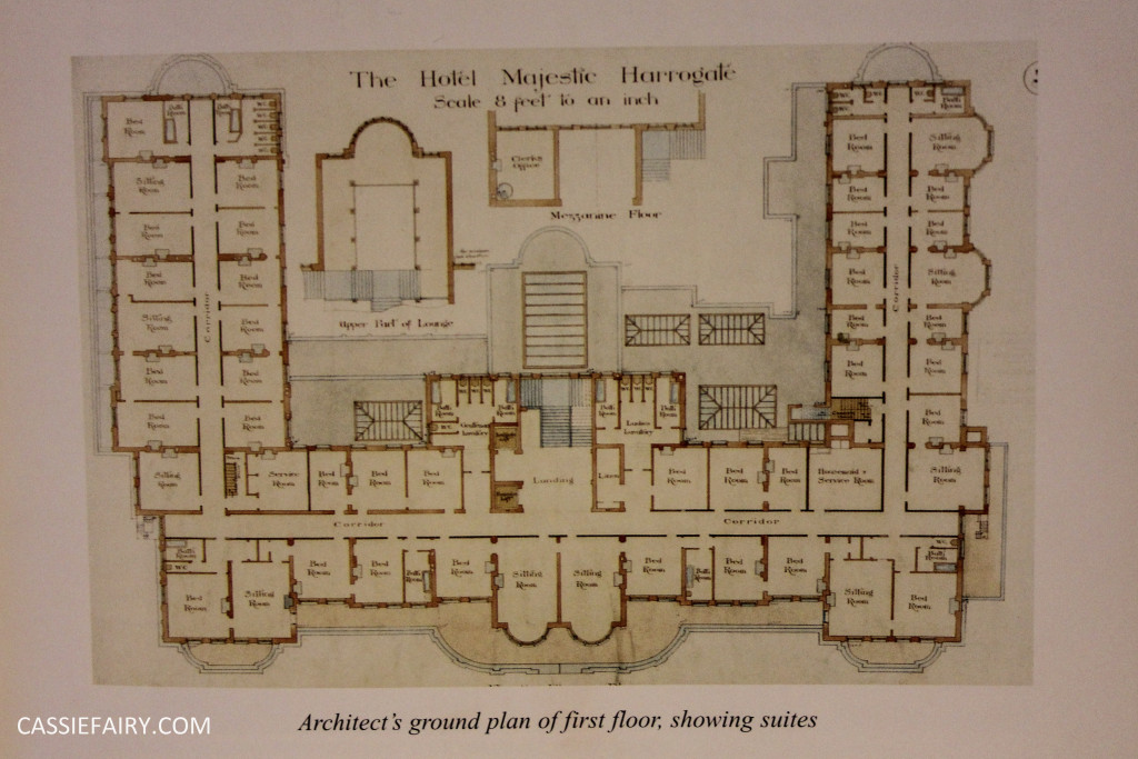
An interesting fact about this Victorian landmark is that it has always been a hotel. This may not seem unusual at first, but when you consider that many hotels start out as country manors or stately homes and have been converted into guest accommodation over the years, the fact that The Majestic was purpose-built as a hotel means that there are no awkward room shapes, no repurposed spaces or unusual design features. The building remains almost exactly the same as when it was first built and retains the features – and feeling – of the era. 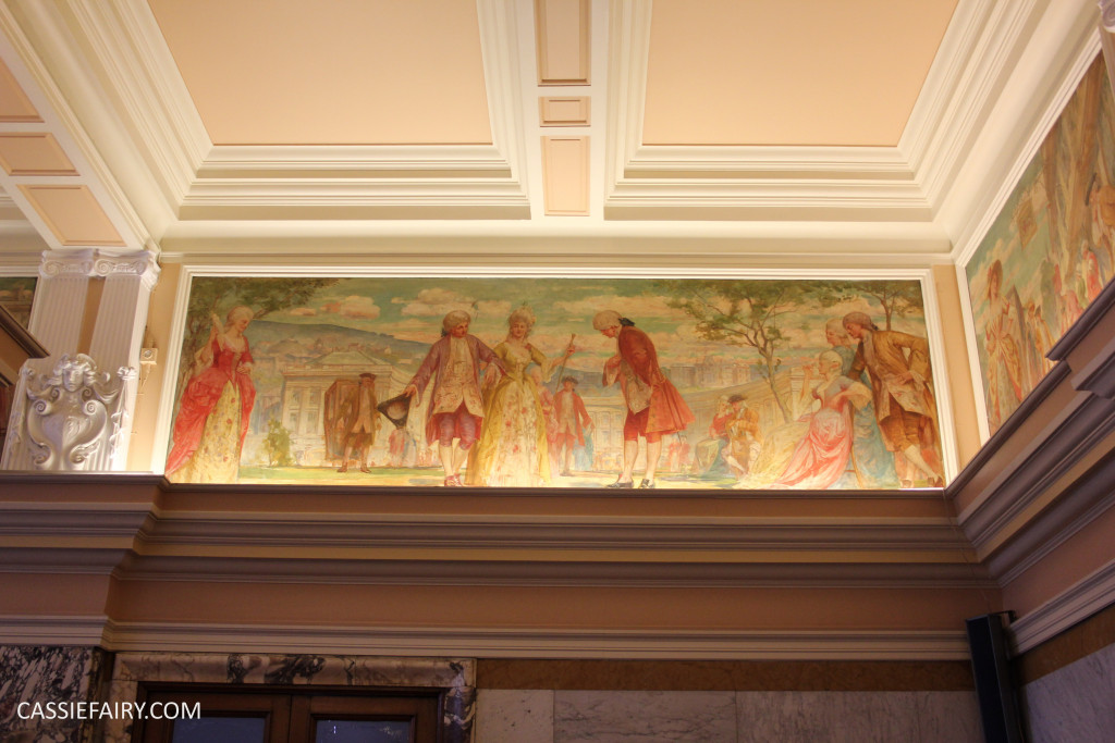
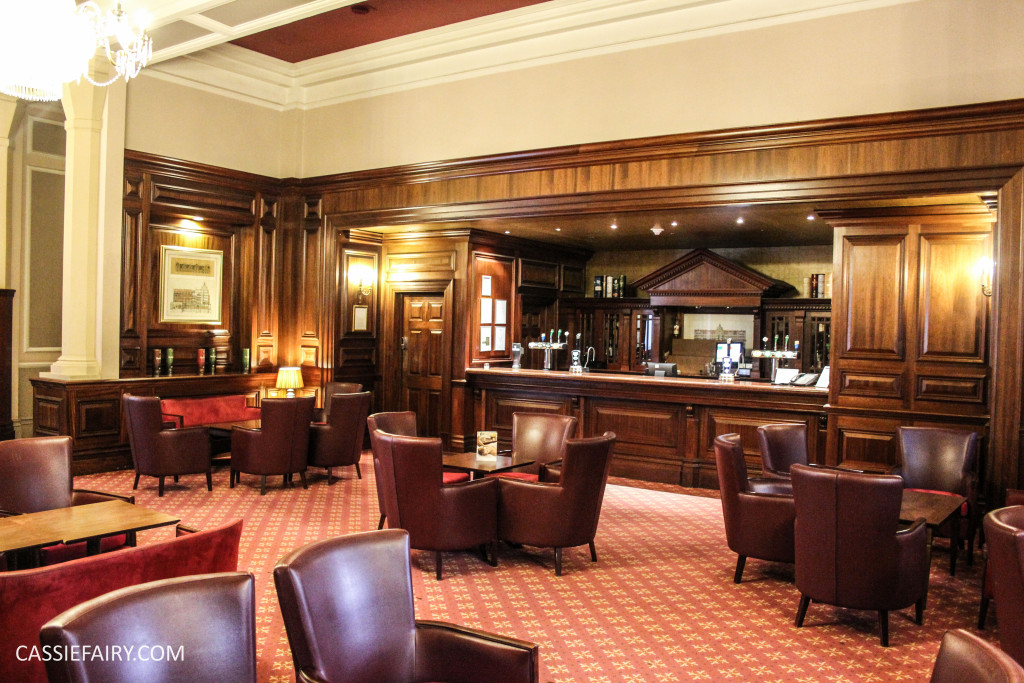 Another rarity for a town centre hotel, The Majestic is set in 8 acres of landscaped grounds. Where other city-break hotels have lost their gardens to building developments over the years, this hotel still boasts a sweeping promenade across the front of the hotel. The hotel is even reinstating the carriage suite where, back in 1900 when the hotel opened, guests travelling by horse and carriage were traditionally welcomed upon arrival and, judging by the high standard of renovation throughout the rest of the hotel, I am certain that this will be a gorgeous suite where many brides will be greeted in the future.
My husband and I took a leisurely walk through the gardens and then headed into Harrogate, and within a couple of minutes we were in the very centre of the town. Of course, we couldn’t spend a day in Harrogate and not visit the famous Betty’s tea room! Having just eaten a full English (and continental!) breakfast at the hotel we decided that tea and cake might be a bit too much of an over-indulgence so we checked out the shop and purchased some of the famous tea so that we can enjoy a taste of Yorkshire at home.
Back at The Majestic Hotel I got carried away taking snaps of the ornate interior and you can probably guess by these photos that I was completely wowed by the stunning chandeliers. The Reading Room below is often used as the venue for wedding ceremonies, with the bride and groom being married beneath the amazing crystal chandelier – just imagine how beautiful that would be.
I actually looked it up when we got home and borrowed the wedding photo above from the hotel’s website, I hope they don’t mind! The room has a capacity for 100 guests at the ceremony, but the hotel also has larger spaces for up to 600 guests in the dining room and adjoining ballroom, or smaller rooms such as the Normandie Suite which caters for intimate ceremonies of 30 guests. The traditional features of this Victorian hotel would certainly add to the grandeur of a wedding held at this venue, including the ornately-carved wooden fireplace in the Billiard Room and the stained glass designs of the French Restaurant below.
At the start of this article I promised you interior design inspiration and I’d specifically like to draw your attention to the hotel’s use of Pantone’s Colour of the Year in their décor. This year’s colour is Marsala, a gorgeous dusky burgundy shade – see my blog post about the colour here – and I was surprised to see that the hotel has already been using this colour in a number of places.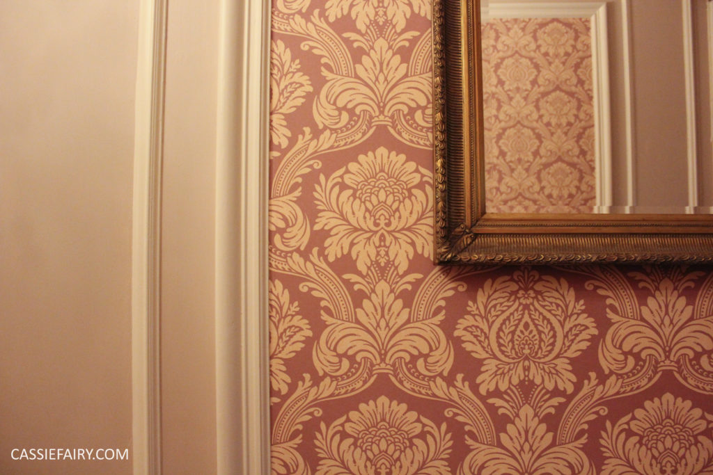
The first thing that caught my eye was this gorgeous wallpaper which lines the grand hallways of the hotel. I love the cream pattern, which breaks up the dusky burgundy shade and adds opulence. Panelled spaces are papered in the centre and the surrounding walls are painted in a coordinating nude pink shade to bring light to the space.
A fully wallpapered room might be overpowering in a smaller space but this panelling technique can be used in home design too, and would allow you to include more daring colours and patterns in your home without it being ‘too much’. Here’s another example of the use of wallpaper panels from the hotel’s dining room – again it allows you to use a bold pattern, grey woodwork and even a black ceiling without making the room feel oppressively dark.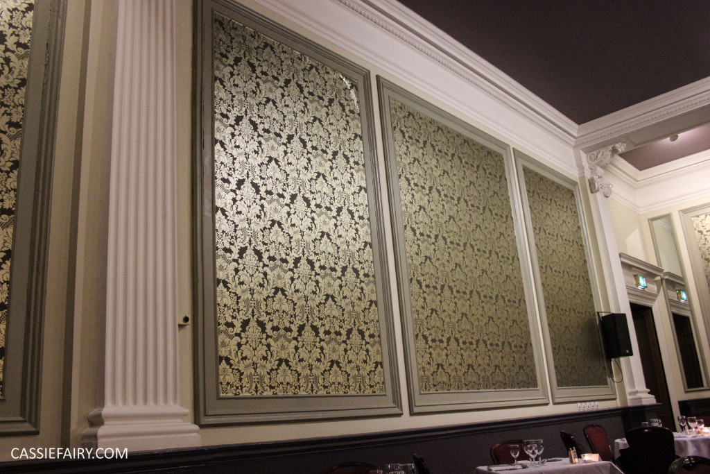 Interestingly, the hotel hasn’t simply invested in a new design scheme as soon as the Colour of the Year was announced – it was redecorated 5 years ago when a fire caused the hotel to close for a few months. It was during this time that the décor was updated and the forward-thinking design team clearly picked up on this colour trend back in 2010. The result is a very on-trend interior design theme that doesn’t look out of place in a Victorian building, and that really impressed me.
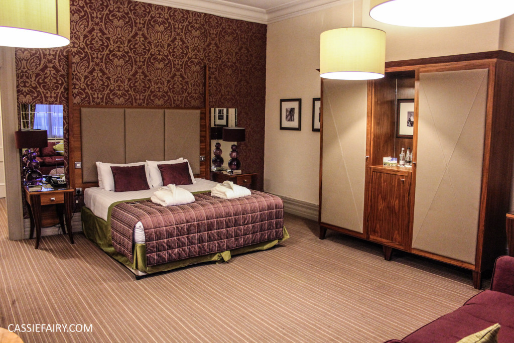
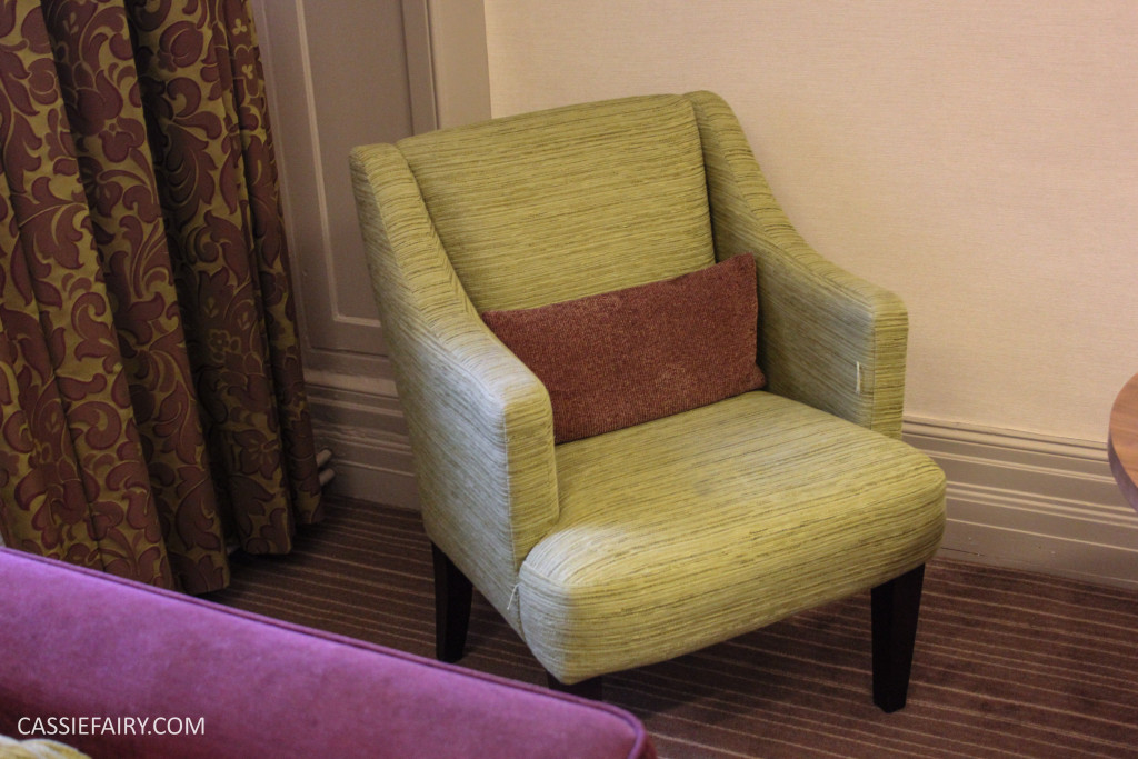
It’s important to ensure that interior design choices coordinate well with your existing decor and style of property otherwise you’ll end up with a living space that quickly becomes dated and you will be desperate to redecorate every year! The room that we stayed in was one that been decorated as part of the recent renovations and again the dusky burgundy shade is evident in the wallpaper, carpets, bedding and even the Louis style chair has been upholstered in a Marsala fabric.
In this room the designers have chosen a lime green as the accent colour and even though the feature wall is ornately patterned, the colour combination completely changes the whole style of the room, making it feel modern rather than traditional. Glass and mirror also help to bring the dark wood furniture up to date and create a room that feels opulent and classy yet very on-trend for 2015.
The bathroom features dark colours and patterns, but when combined with a white suite and light grey textured tiles the room still felt spacious and bright. A bathroom is a great space to experiment with more daring colours and patterns so take inspiration from The Majestic and install some patterned wallpaper-effect tiles to get a luxury 4-star hotel wash room in your own home. The inspiration for this black-and-white bathroom has clearly come from the hotel’s “famous” men’s toilets and I was lucky enough to get a sneaky peek into a room that no other female hotel guests have been in before and I learnt all about the history of the room.
I was not prepared for the size of the space and was surprised to learn that meetings and – aptly enough – washing product conferences had even been held in these men’s toilets. Traditionally, male guests would spend more time IN the bathroom than out of it, and a smoking bench was installed, allowing the men to linger in the loo for longer.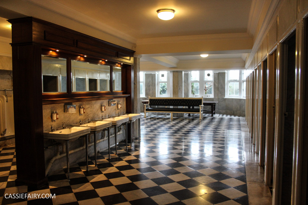
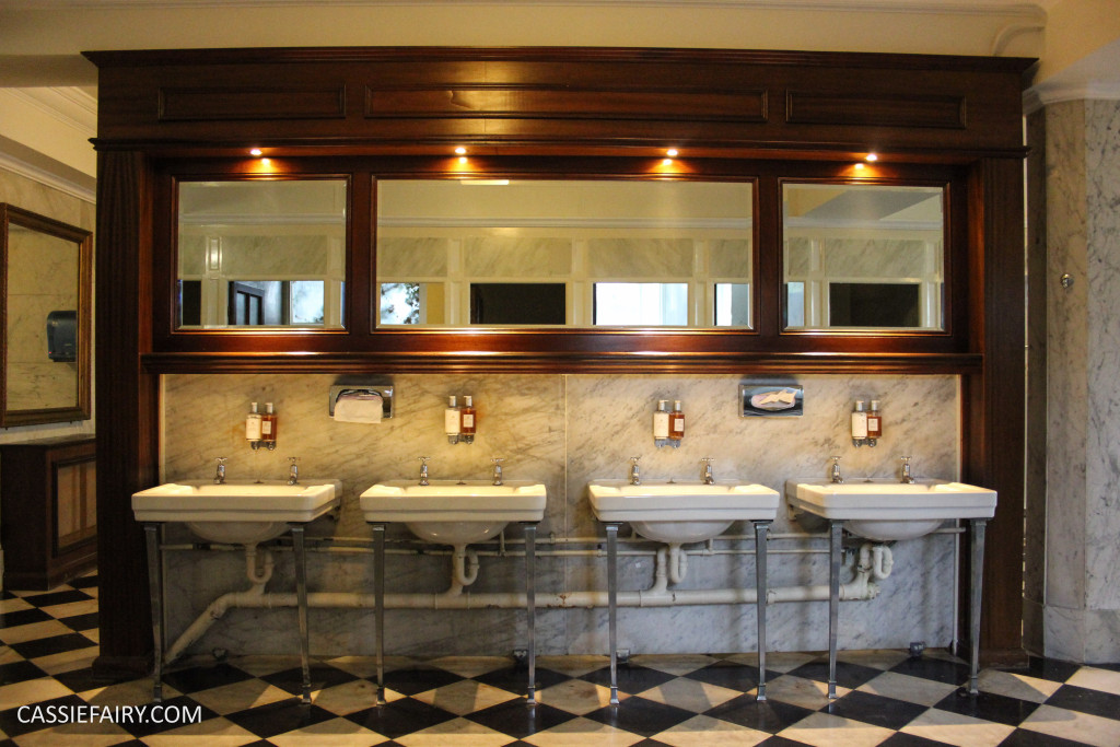
In later years, when part of the men’s wash room was partitioned off to make space for a ladies bathroom, letters of complaint were even published by the Telegraph! I can see why this is a ‘legendary’ part of the hotel and in truth, I would love to have those basins and wood panelling in my own bathroom. I’m certainly going to be taking inspiration from the tiled floor and lay a similar black-and-white checkerboard pattern in my kitchen when it is decorated later this year.
I think it’s safe to say that I’ve been thoroughly inspired by my stay at The Majestic hotel and I will be taking away plenty of design ideas for creating luxury interiors in the future. I was especially wowed by those chandeliers and gorgeous panelling, and I’m already planning a trip back to Harrogate to enjoy the atmosphere of this grand Victorian hotel once again.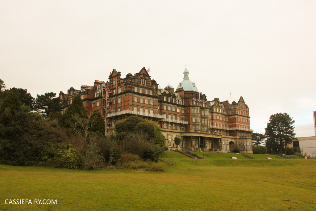
What do you think of these features and trends? Have you been inspired by any of these rooms? Let me know if you too have been inspired by places you’ve visited or hotels you’ve stayed in by leaving me a comment below. Thanks!










2 responses
It was a really amazing building, packed full of design inspiration, I really enjoyed having a look around!
This looks absolutely amazing!
Sarah
https://everydayconcepts.wordpress.com/